


It's been a busy day as I've been making notes on this book that I…
AveryA
I quite fancied putting up my feet today and continuing to read the latest Guy Gavriel Kay novel out in the studio with the cricket on the iPad in the background but it’s been eight days since my last painting. I do keep telling myself that it’s not a great idea to paint when I’m not in the mood and I think the message has got through but the thing is sometime ps you have to paint when you’re not in the mood? What if I was a wildcard on LAOTY and not in the mood on the day? Well, I think I had to do some painting today, just to keep my eye in.
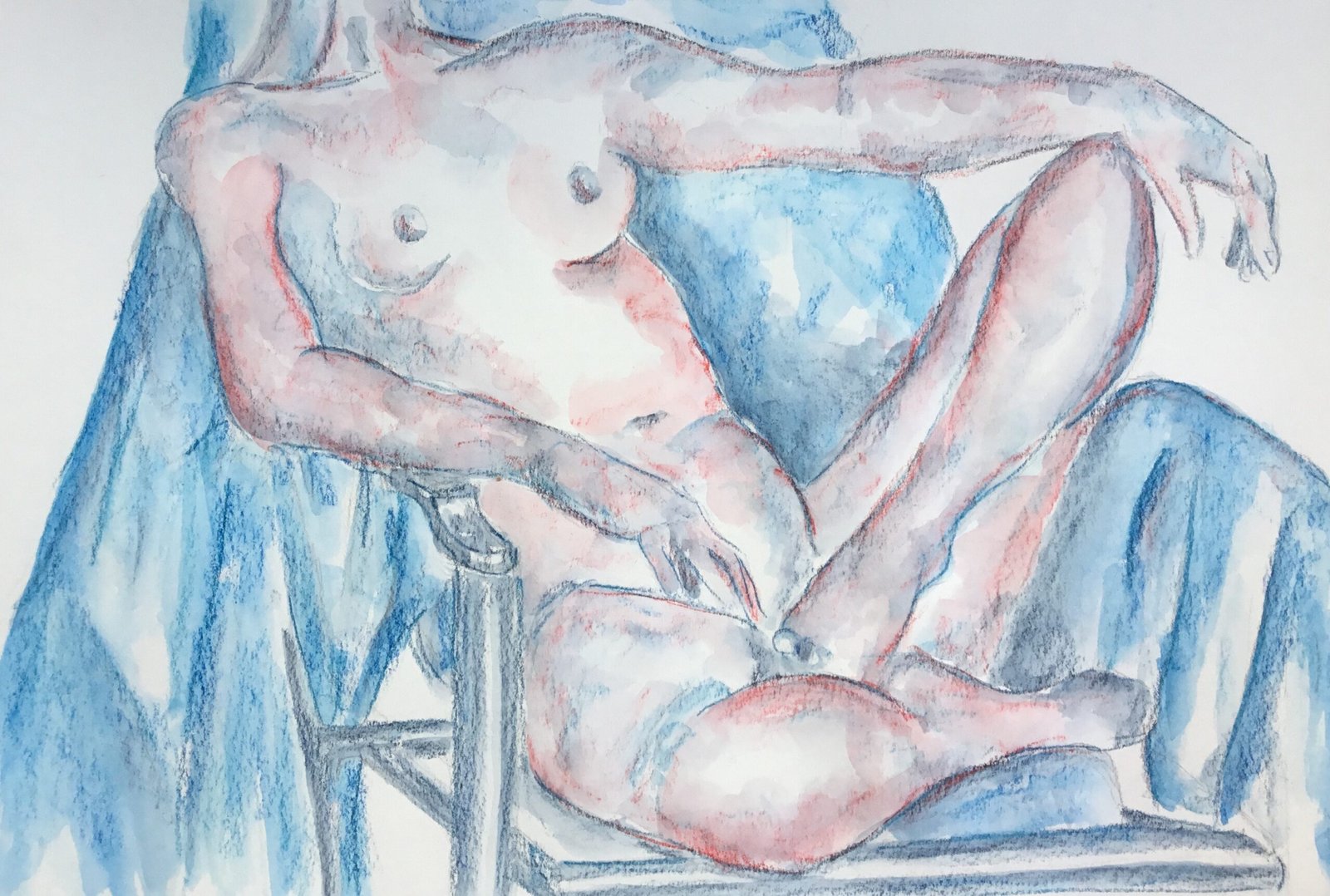
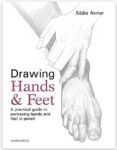
I picked out this pose by AveyA because it would give me the opportunity to paint a couple of hands, something I thought I needed to do after reading the Eddie Armer book. It’s tempting to charge through my stack of birthday books, making whites and posting reviews but it’s a better learning experience for me if try putting some of this stuff into practice as quickly as possible. Hence hands. As my order of charcoal paraphernalia from Jackson’s still hasn’t been dispatched, it might be a while before I can try out the charcoal, so hands it is.
After getting down an initial drawing, I stared by putting down deep indigo in the darkest areas. I then assed in some sea blue in the mid value areas and areas where dark shapes covered adjacent areas on the body and the background. Maybe I should habe just merged dark shapes in the background and on the body – I’d have had no hesitation doing this in watercolour. And then I remembered an idea from the Kate Boucher book on adding little bits of colour to a monotone painting and thought I’d try this out by adding some poppy red in places. But I screwed up by adding too much of the red. Oh well.
After wetting all the marks, this point I stood back from the painting and asked myself whether it was finished. Well I liked Avery’s left hand but not her right and thought that both would benefit from having some sketchy outlining added. I picked out a new colour, bright blue, for the outlines and added them all over the painting. To keep things harmonious, I also added some light blue shading with the side of the pencil to the background. Then I had second thoughts, thinking the outlining looked too sharp. So I added some bright blue shading to outlines around the background and poppy red shading to outlines around the body.
After wetting this second set of marks I could see that the bright blue was much more vivid than I was expecting. Maybe it’s a pthalo blue, because that (as Winsor blue green shade) is highly pigmented as a watercolour. But, because any more marks would have made things worse, I stopped painting at this point.
Avery’s left hand and forearm are close to perfect here, making this a worthwhile exercise. But everything else is a bit bleugh with no redeeming features. Outlining almost never works for me in these paintings and there’s a disconnect between the body and he background. This one won’t be going in the shop window.
I might just need to take a break until I can get started with the charcoal.
Leave a Reply