


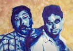
Today I've been painting Hale and Pace, a comedy double act from the 1980s and…
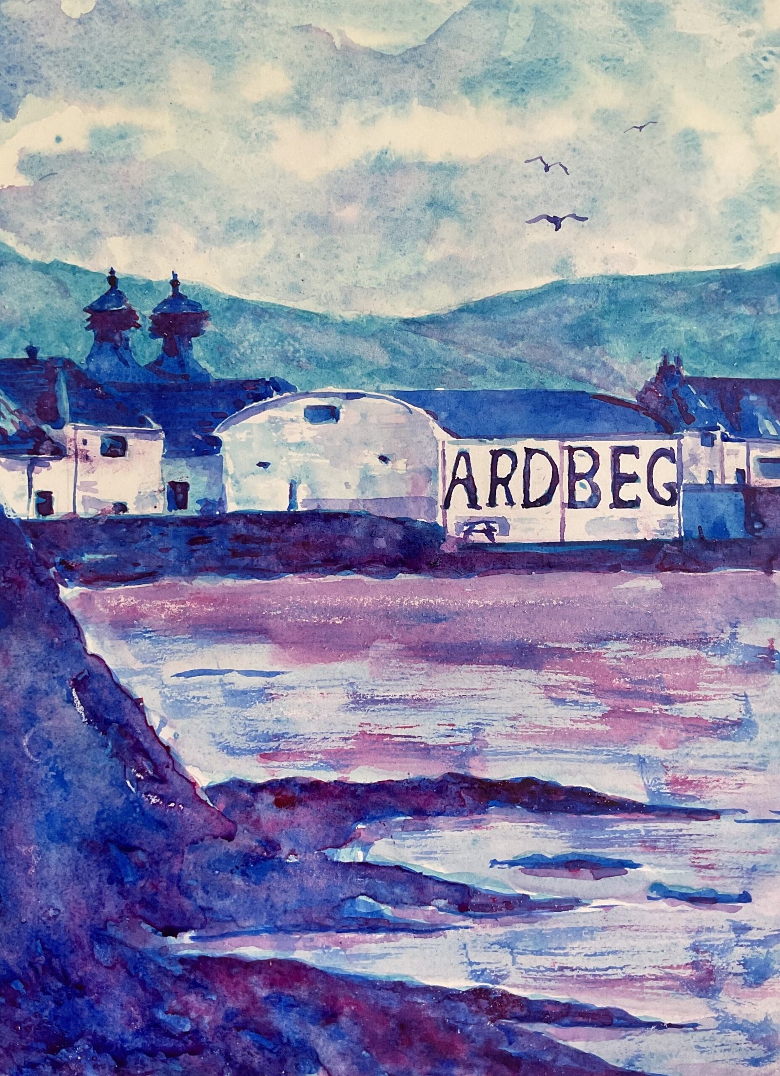
Ardbeg Distillery
I’m back to painting distilleries. Today it’s the Ardbeg Distillery on the island of Islay. I’ve deviated a bit from my normal rule here as I didn’t sample the Ardbeg last night but I did enjoy one on Friday night and may well treat myself to another tonight.
The three colours today are cerulean blue, French ultramarine and quinacridone magenta, the three colours in my blue notan colour scheme but this painting didn’t follow my notan rules everywhere. Let’s go through the five major shape masses in turn.
I thought I’d give hot pressed (i.e. extra smooth) paper a go today, to see whether it might help me get down building shapes more accurately. An interesting experience. If anything, I found it harder to “control the bead” on this paper and felt that my outlines were less accurate than normal. After putting down a pencil outline, I prepped the paper a bit by dragging a candle lightly across the water and diagonally down the rocks.
The Notan app was telling me to leave the sky white but with these three colours being great for skies, I couldn’t resist adding some colour there. I started with cerulean blue, leaving some white spaces, then dropped the other two colours in together in places. I dabbed at it all with kitchen paper to keep it light.
There were no hills behind the distillery in my source photo so I’ve exercised artistic license to add them in here. I thought the painting needed the extra depth that hills would give. The main colour there is cerulean blue, in a much darker concentration; than the sky, and I added some watery washes in the other two colours later for a bit of variety.
The buildings are where I stuck most closely to the recommendations of the used the notanizer app. I use masking fluid to get the letters in the wall working reasonably accurately. This meant masking over er some buts where drainpipes were supposed to be, so I added these later after the masking fluid came off.
I had fun with the rocks. I started with cerulean blue all over, as recommended by the app, and then French ultramarine over most of that area, as also recommended. Bu5 I tried ti breathe texture at this stage using stabby brush strokes. For the third layer, the app only recommended the odd bit of the red here and there but I added more, again trying to create texture. I also racked things up with some granulation medium and salt.
The water started with lots of ceruean blue, then a bit of ultramarine and a bit of the magenta, all wit/ the edge if quite a dry brush. I tinkered a bit, adding water, making things run together and losing the brushmarks. So when it was dry, I added more brushmarks with the ultramarine and the magenta. And I mixed those two colours together to get a violet and used this to paint in reflections.
And that was me done. I never really know whether other people will like my paintings but I get a funny feeling that they’ll like this one more than I do. I’m putting this one in the shop window but also looking at it and thinking I could have done much better. To see the price, click here.
Leave a Reply