


The plan was to do three dash and splashes today but we had an early…
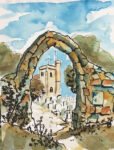
Archway Into Hartlip Church
Enough of these village houses! I wanted to paint some stones, so it’s back to the church to paint this archway again.
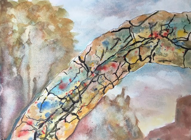
I first drew the archway using a rollerball, including all the cracks and climbers that I could see. The plan was to make the archway quote colourful and in a light value, with the trees behind in a dark value. I was going to leave all the cup racks showing up in rollerball. Good to have a plan, even if I didn’t stick to it.
The three main colours today were cerulean blue, raw sienna and Winsor red (the key of green warm). Cerulean and raw sienna are always good for stonework with their tone and granulation. Winsor red seemed to form a good combination with them according to my swatches. Four opaques also made guest appearances though (more on these below).
I started with the arch, with all three primaries and allowing them to run into each other. But because I wanted a few more spots of colour, I reached for my three primary opaques (cobalt blue, cadmium red and cadmium yellow). I dropped in some big spots but also did some spattering. Before spattering, I wet all the background so that any spatters missing the arch could be quickly removed. I painted in all the darkest bits with sepia but didn’t like the random of darks that resulted from this, so also painted over most of my market lines with sepia. It might have been a mistake to use sepia in this way at all – if I had my time again, I’d just do sepia spatters. I added salt to the archway but it didn’t react today – maybe the paint was too dry when I salted it.
Cobalt blue, by the way, is doing a better job as the opaque blue in paintings like this than cerulean ever did. When I finally get a brass 16-colour palette, it will probably join cadmium red, cadmium yellow and sepia as the four extra colours in addition to the 12 currently in my palette. It means that Payne’s grey (as well as titanium white) will miss out.
And then I added the background using only my three transparent (and semi-transparent) primaries. It’s been a while since I used raw sienna in a sky but, rather than going for the Ron Ranson skies that I used to paint years ago, I couldn’t resist throwing in some red to create grey clouds. I wanted the trees to be darker than the arch but the paints just weren’t having it. I created interesting textures in there using water drops, creating back runs.
In the end, I think I’ve ended up with an OK painting. The reds, yellows and blues in the arch are great. The background is suitably understated and, despite having interesting textures, doesn’t distract from the arch. The one niggling thing is the contrast between the arch and the background – they look like two different paintings. The painting may have looked better either without sepia over the cracks or without any rollerball lines.
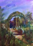
Still, it’s a success. Just like all my other Hartlip church paintings, it sold within a day and all the proceeds were donated to the church.

Leave a Reply