


Oil pastel paintings are (for me, for now) faster than watercolours, so are the ideal…
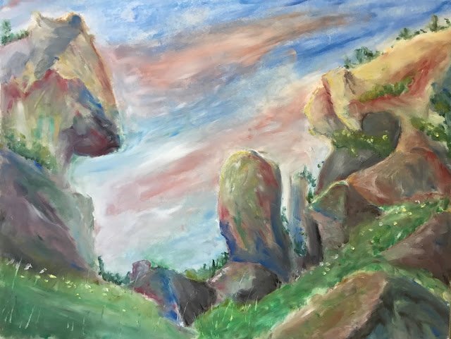
Animal Biscuit Valley, New Zealand
I’m still on the oil pastels but it’s a landscape in New Zealand today. Well kind of. I’ve been a bit smart today and left out some rocks that weren’t adding much to the picture and added a load of grass. I need to be a bit less reproductive in my landscapes and start making paintings rather than trying to create photographic reproductions. Even today, there’s something in the painting that I should have left out.
One good thing about landscapes is that I can be a bit more free and easy putting down the initial drawing. With the figure drawing, I’ve been starting by putting down a 3*4 grid of squares to help me get all the proportions and positioning right. With this painting, I just put down some freehand outlines with an oil pastel. Then a second outline when I wasn’t happy with the first.
I started with the sky. I don’t like to do plain blue skies, so I put in some clouds. They were initially sloping down from left to right but didn’t really work that way, so I changed them to slope the other way, which is my default sky colour sloping direction, to be fair. Note also how the top left corner is a sky blue but the top right is a darker blue. This is something I always try to do with the oil pastels.
And then the rest of the painting. I wanted to get all the rocks right before adding the grass. The rocks on the left came out the way I wanted really quickly. They look like a chess knight, which I really like. Then I moved on to the rest of the rocks. It took me a while to get them looking consistent (not identical – I need to think about the sunlight) with those on the left. In particular, I wanted the red and the dark blue to show up as individual colours within the rocks. I got there eventually.
Finally, I added a bit of greenage, taking advantage of the wide range of greens in the 24-colour Sennelier landscape collection. These came out well, especially after I added some yellow and white flowery dots and scraped out some grasses.
The best bits about this one are the colours in the rocks and the knight-shaped rock on the left. The bits I like least are the clouds (edges not fluffy bough), the cave on the right (should have been left out) and the grey rocks a bit down and left from the cave (might be the first time I’ve created mud with oil pastels). On balance, though, this feels like a success and is going up for sale.

Leave a Reply