


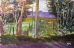
Back to the painting after a few days' break. This is another scene from the…
And The Dirty Old Track Was The Lower Hartlip Road
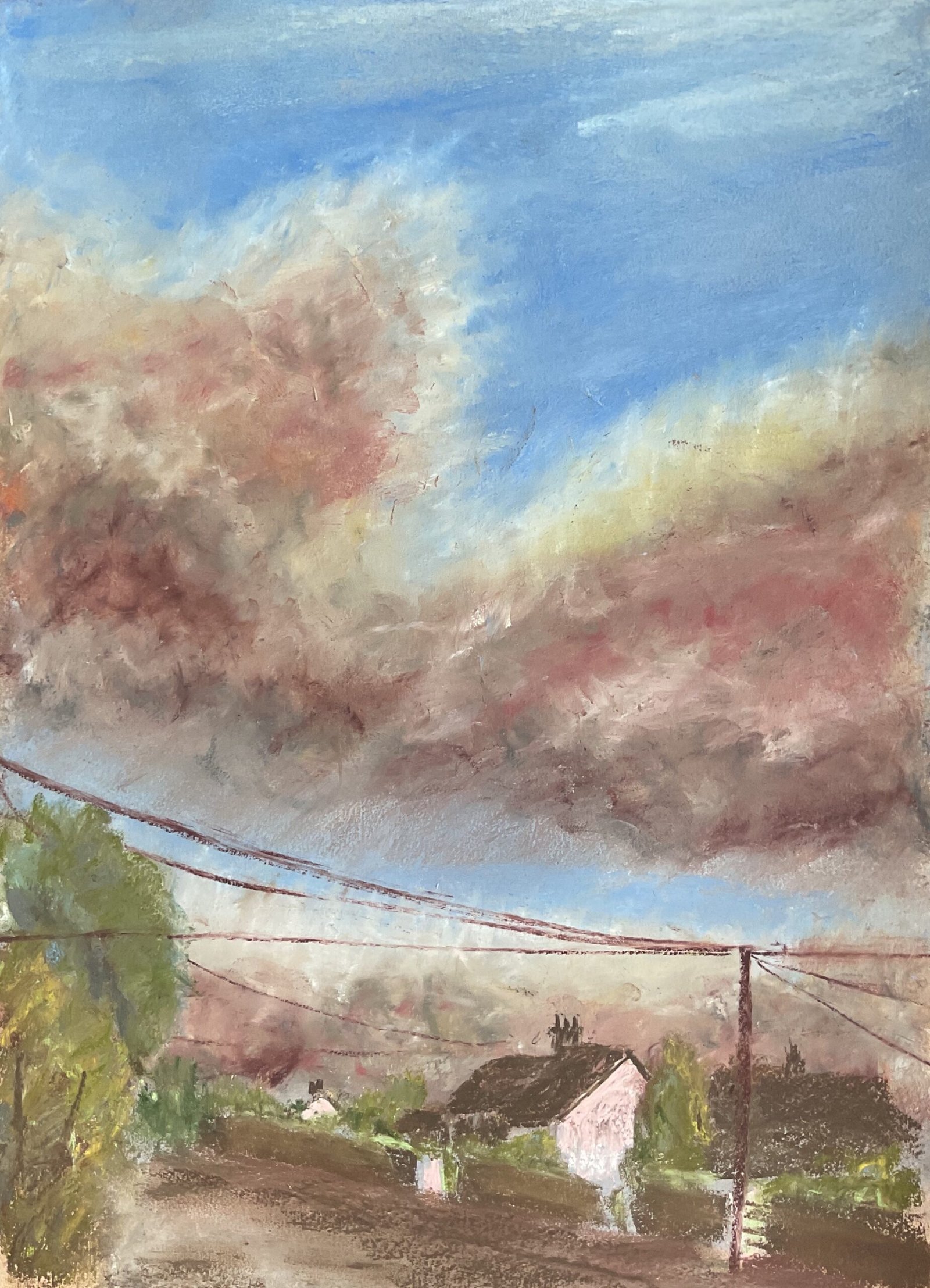
After reading the Sandra Orme book, I’m straight in with a sky painting. What with me having a set of “cloudy sky” colours with no reds and my only yellows being part of my portrait set, this was always going to be based on clouds against a blue sky and not on a sunset or sunrise. That’s not to say that I didn’t have fun with colours: you can see that I did. The sky is the real star of this one, the foreground only being there to support it.
The sky was what took up most of my time. I followed Sandra’s five stage process. The first stage was all about getting some simple colours down with the sides of the pastels, filling the tooth of the paper and rubbing them in with quite firm pressure. Fit the second layer, I made firmer marks with the tips of the pastels, looking to create interesting colours in the clouds and smoothing them in gently with a finger. For the third layer, I tried to add some three dimensionality to the clouds and to create dark and light areas using a wider variety of mark making and smoothing the marks in with colour shapers. The fourth layer was about adding more detail in places and smoothing with colour shapers. The fifth and final layer was about getting wispy edges on the clouds. Once this was all done, I was left with a pretty good painting.
But I still needed a foreground to offset the sky, so I picked out a local photo with just enough going on to be able to work. Being a local photo, it means this painting join the waiting list to be exhibited at the Rose & Crown. The original idea was to have a silhouetted foreground but I couldn’t resist the bright whites of a couple of those houses, so just settled for minimal detail instead. I thought about leaving out the telegraph wires but decided to include them: they’re like an extra little topping. In other words, they saved me having add in birds. The wires themselves were dyed in soft pastel but maybe I should have used charcoal pencils.
I’m happy with the result. I like how the roof colours match the clouds and how the greens and reddy brown complement each other. I guess the real question is whether I’ve been too over the top with the cloud colours. Maybe I have but I can’t help wondering whether a cloud of whites, creams and light greys might have just looked boring. Anyway, this painting represents real progress with the soft pastels and is up for sale. To see the price, click here. I can feel more sky paintings coming on and will be gutted if I don’t get some reds, yellows and lilacs at Christmas.
<This is one of a number of local paintings that have been lent to the Rose & Crown in Hartlip to display on their walls. It remains up for sale whether via me or via the R&C. There’s no price difference.>
Leave a Reply