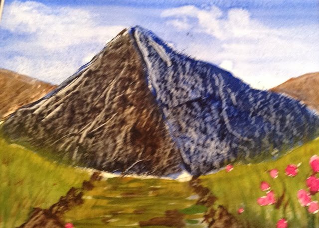
24 August 2014 I don’t think this one has any redeeming features. The hill at…

An Ugly Mountain
29 October 2013
We’re now in the Facebook era and everything I paint is going up there. This means I get to show off all the clunkers on this blog, providing some proper evidence of just how bad my painting was.
And we start off with this two-tone mountain. What can I say? Well, the sky was good. And the mountain might be good in black and white. I did get a good textural effect from scraping at the mountain with an old credit card. But in colour, that blue half of the mountain is just wrong. And I can’t do foregrounds.
This painting was never framed. It has long since been thrown away.


Leave a Reply