


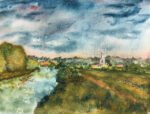
So today I headed out to the river to do some painting. Not being allowed…
An Arrogant Intrusion
I was watching an interesting video by Liron Yanconsky on YouTube the other day in which he painted a church in monochrome without putting down a pencil outline to guide himself and felt inspired to give this a go myself.
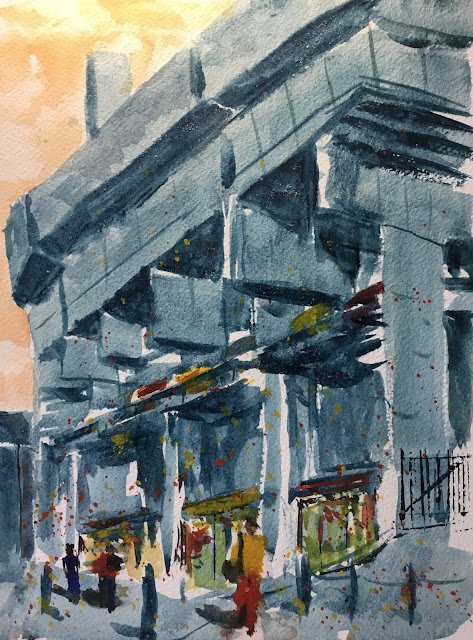
I looked through my photos of potential scenes to paint and decided to go with this one. It’s a view of a New Court, Christ’s College, Cambridge from the back in King Street. For many years, this building looked like a really small, ugly car park. It was described as “an arrogant intrusion on King Street” and I really can’t argue with that. It was built in 1968-79 and still looked like this in my 1982-86 spell at Christ’s. At some point since then, though, it has been modified and no longer looks like a car park. There’s still a row of shops along the bottom but the entrance to the car park has been filled and what was once the upper floor of the car park is now college rooms looking out onto King Street. New Court has learned to fit its surrounding apps at last. There is another college building development going on in King Street at the moment, and this is one that will fit in with its surroundings. Some King Street buildings will be almost completely demolished, leaving only the fronts of the former buildings as the college’s Northern boundary. It’s going to look good.
I picked Mayan blue as my main colour. I wanted to give this blue a serious workout. I’ve been using this blue a lot lately and need to go back to my others at some point, so thought I’d make the Mayan blue’s last outing for a while a big one. I decided not to make this a monochrome painting though. I wanted to bring in other colours to bring out the soulless mess of the concrete. So for the orange (complementary to blue) sky, I used Indian a yellow and Winsor red, maybe with a bit of rose dore. So this painting just about qualifies as being in the key of orange cool.
I also wanted to add some people in the foreground to include some life. These are mainly in the usual opaques (cadmium red, cadmium yellow and sepia) although I did use French ultramarine for the woman on the far left. I also used these colours in the shop fronts and in a row of parked cars.
I stopped for lunch at this point. When I looked at the painting afterwards, it didn’t right. The street felt too cool. I thought of two possible ways to change this. One was to glaze a yellow or orange over the street and maybe the building in the far left. I decided, though, that this might make New Court stand out too much against its surroundings. When you think you’re being overly brutal in a painting of New Court, that’s pretty extreme. So instead, I went for the spattering of the cadmiums, trying to graduate the density of spatters from full on at the bottom to very light at the top.
A couple of special effects worth mentioning: I threw some salt onto the Mayan blue to get even more texture and the gate on the right was stamped in with an old credit card.
So, how was it? Well, I think everyone can see that this was painted freehand without a pencil outline. On the other hand, that does give this painting a bit of life and vitality. Sometimes putting a drawing down first sends me in a bad direction, wanting to include too much detail and then treating the rest of the painting as a colouring in exercise. The people in the foreground aren’t great, but at least the eye isn’t drawn to them: it’s drawn upwards to the top of the building. Where this one suffers most is probably the lack of a focal point: everything is loose and blurred. Makes a change to everything being in sharp focus, which is just as bad. Anyway, this one’s good enough to go up for sale.

Leave a Reply