


After Galen went so well earlier this month, I thought I'd have another go with…
Ameeka III
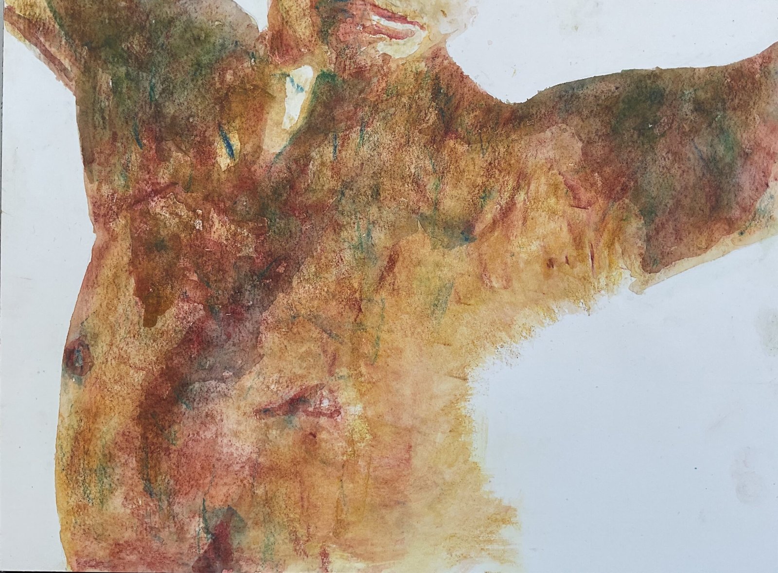
Someone made a comment on LinkedIn about my painting of Alex, saying that she liked how the viewer had to do a little work before the image would become clear. Liking the sound of this, I searched the internet for a model pose with a lot of highlights so that I could leave a lot of the body white and make the viewer fill in the gaps, like with this painting. I found a great pose by Ameeka, making her third appearance on this blog, and decided to use the Artgraf blocks.
I started by creating a three value plan on the Notanizer app, marking down the outlines and making out all the highlights. Or in the case of the three big background shapes the edges of those areas. Then I added pigment to the dark areas, starting with sanguine, then yellow ochre and then lots of blue, green and sepia in random places. Maybe I should have left out the sepia but too late now. Then I went over the darks with a wet brush, trying to be random and expressive and letting colours run into each other, rather than imagining I was cutting the grass at Wembley Stadium.
Before starting on the midtones, I had a think. The darks were quite conventionally fleshy, so I added more blued and greens to them. Then I went over everything (darks and midtones) with sanguine and yellow ochre and put down some yellow in the best lit places. I then removed any masking fluid separating midtones from highlights (where I wanted soft edges) but left the masking fluid on the face and everywhere where it separated the background from the body (where I wanted hard edges). Then I wet all the pigment, starting in the midtones and brushing it into the darks. And trying to create soft edges where these were required.
Then I removed all the rest of the masking fluid and took a look at the results. The contrast between the midtones and highlights on the body felt wrong. Not hard edged wrong but too big a difference in values wrong. So I put down a thin layer of yellow ochre in the highlight areas to hint at the body there and wet it by dabbing with wet kitchen paper. And, ah, yeah, looks like I was too heavy with that yellow ochre. My highlights have gone. I then did a little bit of fiddling, adding more blues red, magenta, green, sanguine, yellow and ochre to the rest of the body and activating it by dabbing with wet kitchen paper. And that was me done.
It’s not one of my favourites, this one. It’s all a bit messy and there are none of the missing pieces that I wanted, making it too representational and too easy to judge for accuracy. And there are too many visible block strokes for my liking. Still, it has a charm of sorts and I’m putting it up for sale, with the price to be found here.

Leave a Reply