


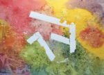
Yesterday I kicked off an abstract painting. I put on some masking tape and some…
Adrina In Watercolour
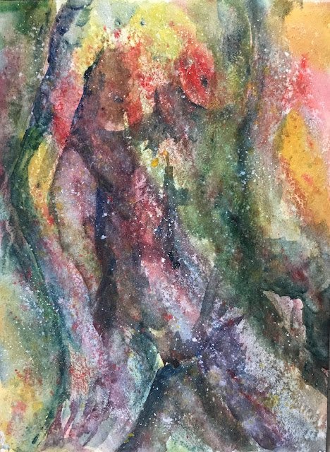
My plan today was to play things fast and loose by putting down a random colourful underpainting and then to convert it to something else with some subtle negative painting and a little bit of detail. I was expecting to end up with a landscape painting with a skyline and some windows but ended up with something else.
For colours, I went for a warm green colour scheme because it gave me the most colours to choose from. I have three cool blues (cerulean, Mayan, Prussian), two cool yellows (transparent, raw sienna) and two warm reds (Winsor, rose dore). I used all of these plus the viridian. Cadmium red, cadmium yellow and titanium white all made cameo appearances as spatters at the end.
I started off with a random underpainting, featuring all of the main eight colours, generally painted along a diagonal. I threw on loads of salt and spattered some Prussian blue and Winsor red over the top, writing off a t-shirt in the process.
Once this had dried, I had a good look at what I had and looked through my stash of photos with ideas for future paintings. As I said at the top, the idea was to come up with a landscape but I actually ended up with this figure drawing pose by Adrina. The attraction behind this was that Adrina had some diagonal lines in her pose in the same direction as the underpainting and that I might be able to bring her out of the painting with a simple outline and a handful of extra marks.
Pencil marks didn’t show up well on the underpainting, so I was effectively painting the figure freehand. This was made even more difficult by having to paint her negatively. It took a lot of painting and a lot of corrections to get to my final painting. In places I’ve had to paint her positively, which isn’t necessarily a bad thing. Positive and negative marks for variety.
I finished off with spatters from my three favourite opaque colours because this felt like the sort of painting that needed that sort of finish.
Overall, I’m undecided on this one. I like the ideas behind it but the execution isn’t as good as I’d hoped. It feels muddy when I wanted it to be colourful and energetic. The left hand on the thigh is light coloured and negatively painted but it’s easy to mistake the blue/green shape above it for a misshaped arm. I’m thinking this one won’t be going up for sale unless it gets rave reviews on Facebook or Instagram.
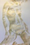
Meanwhile, I’m reaching for the inktense pencils. I’m going to have another go at doing this pose some justice.
Leave a Reply