


Wednesday 3rd February, 8pm, Sky Arts. That's when I'll be appearing as a wildcard. Best…
Abraham Lincoln
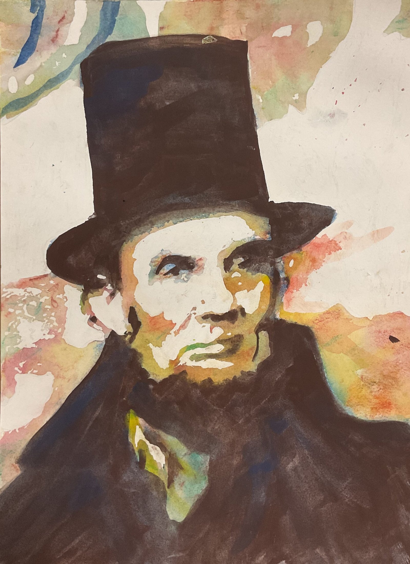
It’s time to give the Artgraf blocks another go. Today’s subject is Abraham Lincoln, the 16th President of the United States.
I still don’t have a settled process for using these blocks, so let’s go through what I did. I started by putting my source photo through the Notanizer app to create a three value plan. I marked everything down on paper (hot pressed watercolour paper) in pencil and masked out all the highlights with masking fluid. The paper itself was a standalone sheet rather than the top page from a block as the last time I’d used the hot pressed block I’d removed two sheets after finishing the painting. I probably should have taped down the edges of this sheet but decided to paint on the loose sheet: this may have been a small error, While the masking fluid was drying, I had time to reconsider my decision to use Artgrafs: I could have switched to crystalline watercolours at this point if I really wanted to.
But I decided to continue with the Artgraf blocks. I shaded over all the dark areas with a bit of blue and a bit of brown (the middle value of my three browns). Then I shaded randomly over all the mid tones and darks with the green, both yellows and all three reds. I sprayed everything with water, then used a dry brush to activate the colour properly, starting with the dark areas before moving on to the mid tones. Everything looked a bit too light valued and I could have left the painting to dry before continuing but instead used the brown block as a pan to create some paint to go back over all the darks. Because the paper was still wet, there was some spreading, especially for the facial details, but that didn’t feel like a big deal. I left everything to dry properly before continuing.
For the next layer of colour, I could have used the blocks dry again before activating the pigment with water but decided instead to use them as pans. I added the green, the reds and the yellows to the mid tones and more of the brown to the darks. I ended up adding yet another layer of the brown to the darks, dropping in some blue in places and letting my brush strokes show in the jacket because, let’s face it, brown is boring and needs something extra to make it interesting.
Then, after everything was dry, I removed the masking fluid and the painting came to life. I did tinker in a couple of places, though. First I corrected the top of the hat, making it rounder but including within it what had been a background highlight, about a quarter of the way in from the right. A bit ugly. Second, there was a yellow shape in the background below the hat rim on the right that looked like a badly drawn ear where the ear would be invisible. I covered this with some red paint and dragged the red further out into the background. This was a better rescue job and less noticeable. And that was me done.
One thing I’ll say about these Artgraf paintings is that they’re always different, probably because my technique is always changing. Today I think my darks ended up too dark relative to the medium tones, making this one look like one of my crystalline watercolour paintings. That said, I do like the medium tone colours in this one. And I like the blues that are visible around Abe’s right eye. It’s OK, this one, and is up for sale with the price to be found here, but those dark areas are too big, too dark and too boring for my liking.


Leave a Reply