


I wasn’t very good at painting and not that committed to improving. I would have…
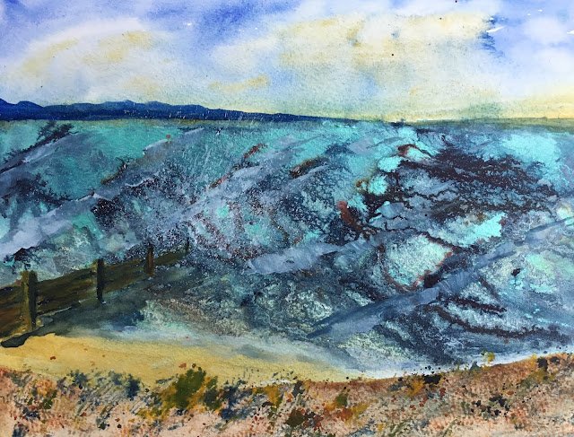
A Windy Day In Whitstable
We went for a walk along the coast with the dog yesterday. On the way back from Whitstable to the car, the tide was in, the wind was fierce and the sea was angry. So I thought I’d have a go at putting some of that on paper. This was also a chance to try out one of two new acrylic inks that I’d bought the day before: waterfall green (the other was gold). The waterfall green looked like a great turquoise colour, something that would be great for the sea and a similar looking colour to something I’d seen in some Ann Blockley paintings.
I used quite a few colours today. There’s French ultramarine at the top of the sky, in the land on the horizon and in the groyne. There’s cerulean blue at the bottom of the sky and underneath all the ink in the sea. And there’s light red and raw sienna in the groyne and on the beach. There’s also some Payne’s grey in the groyne and its shadow and spattered on the beach. And titanium white in the waves and spattered at the end of the groyne. That’s lot of colours for me and I’ve not got to the inks yet. The inks were mainly indigo and waterfall green but there’s also a little bit of sepia and earth red. And the are some special effects in the foreground from painting some shells that I picked up on the beach in French ultramarine and light red and rolling them on the page. That’s authenticity for you.
Did it work? I’m giving a qualified yes. It’s not perfect: the groyne looks amateurish and I had trouble keeping the horizon horizontal. The sea looks good from a distance in some ways but I don’t think I have the angle of the waves right – they should be closer to horizontal than they are.
As this thing dries, I’m noticing that this waterfall green has a shimmer to it if you look at the painting from the right angle. It’s interesting. I see it as a bit of a positive. On the other hand, I’m disappointed in the new ink’s reluctance to flow down the page. I don’t know whether it’s a property of this colour or something to do with the place I bought it (the bottle did need a good shake to mix it up). Sepia, indigo and earth red are my favourites: they could run for England. No, make that Jamaica.
I put this one up for sale for a while but my art’s improved a lot since, so it’s been taken down from the shop window.
Leave a Reply