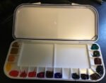
My second job was to load up the Mijello palette that I got for Christmas.…

A Six Colour Palette and the Mind The Gap Approach to Colour Theory
Yesterday’s painting got quite messy and I found that, when I removed the painting from my watercolour block, some of the paint or ink had leaked through onto the sheet below it. I didn’t want to waste the paper so thought I’d spend a pleasant Sunday afternoon doing some relaxing swatching that I’d been thinking about for a while.
This swatching focuses on a six colour palette and the secondary colours I can create from it. I had three objectives in this exercise:
– to demonstrate the merits of a minimal palette
– to explore whether this particular set of six works well together (in particular the choice of burnt sienna as the warm red)
– to introduce my simplistic “mind the gap” approach to colour theory.
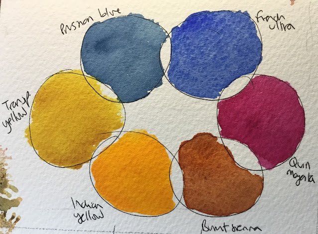
So first up, let’s talk about the six colours. Five of them were always going to be gimmes:
– French ultramarine as the warm blue
– Prussian blue as the cool blue
– Indian yellow as the warm yellow
– Transparent yellow as the cool yellow
– Quinacridone magenta as the cool red
The sixth colour is the most contentious. Single pigment, warm, transparent reds just don’t seem to exist. I have rose dore and Winsor red in my palette but neither are perfect. So, instead, I’ve picked burnt sienna as the wildcard. It’s warm and transparent, has reddish tones and adds some much needed earthiness to the palette that would be missing if I picked one of those other two warm reds.
And that’s going to be the last time I use the words warm or cool in this post. On one condition. And that’s that the six colours are arranged in a ring (or rectangle, whatever) on the palette in the particular order above. All the warm/cool considerations have been taken care of by putting the colours in the right order.
And now, here comes the mind the gap colour theory. We all know that (at least in theory) red and yellow make orange, blue and yellow make green and blue make purple. But with two of each primary to choose from, that gives four possible combinations for each secondary colour, right? So how should I choose between them? This is where the mind the gap colour theory comes in:
– the brightest, most vibrant secondaries rend to be produced by adjacent primaries
– primaries with two other primaries between then will produce pretty dull looking secondaries, maybe even neutrals
– primaries with one primary between them are somewhere in between. They won’t produce the zingy secondaries that adjacent primaries do, but they can produce more interesting, muted secondaries. Or even interesting neutrals. They can be a bit unpredictable actually.
I quite like those secondaries in the third bullet, which is why I like paintings painted in what I call the triadic colour keys. These are sets of three primaries where no two are adjacent – take a look at the photo at the top of this article and you should be able to identify two such sets.
Anyway, let’s go on to specifics, starting with the greens.
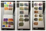
This already presents great evidence for the mind the gap theory. The adjacent combination at the top is bright, maybe too bright. The two apart combination at the bottom is a neutral looking colour, barely green. And the two one apart combinations seem to tread a more interesting middle ground. It’s worth mentioning that dropping a little of one of the reds into any of these greens can mute down the zinginess to something more respectable (I’m thinking of that adjacent combination in particular).
For purples, the adjacent combination is the zingiest and the two apart combination a neutral with no traces of purple (albeit a very interesting looking neutral). The one apart combinations are very different to each other though. On the left we have a sensible muted purple but on the right we have a neutral. This neutral is one to commit to memory, a combination of French ultramarine and burnt sienna. One that would be in every watercolour artist’s top three mixtures. Anyway, as well as providing backup to the mind the gap theory (I did say that single gap combinations could be unpredictable), there’s an important lesson here that burnt sienna doesn’t make purples.
And finally, here are the oranges. All much of a muchness apart from that one on the left. The one at the bottom does look quite neutral. It’s really those two burnt sienna combinations that don’t produce oranges as vibrant as I’d like. Maybe if I’d chosen a warm primary red rather than a warm earthy red, this chart and the purple chart would have illustrated my mind the gap theory better.


Leave a Reply