


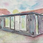
I wandered around the village for a while looking for a subject for my third…
A Secret Worship
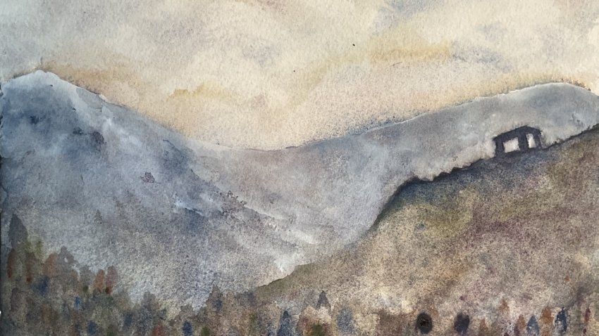
For today’s painting, the first serious painting of the year, I thought I’d try out something Christopher Stephen recently tried out on YouTube, which was to make the Schmincke Supergranulators start playing tricks by painting them straight from the tube onto slightly wet paper and to spray them with water. I decided to use the tundra supergranulators for this and to paint an invented landscape. The idea was that this would be a gently rolling landscape, slightly flooded in places, just like in Chris’ video.
I started by putting in a sky in my normal style, using the blue, the pink and the orange, dropping the colours onto wet paper, charging in drier versions of the colours and finally dabbing some bits with a paper towel. Then I applied Chris’ technique over the whole of the rest of the painting. It worked a bit but not as well as in the video. I ended up adding a few more layers and eventually just using my normal technique of charging drier paint into wet paint. This gives great effects, not as great as the ones that Chris gets, but effects that work every time: it’s a lower risk, lower return technique.
One place the technique threw up a happy accident was on the left, about a quarter of the way up, where it produced an interesting abstract treeline. I tried suggesting trees more strongly with some stabby tree marks and ended up covering all the bottom quarter of the painting. No subtlety there.
The abstract mark making at the beginning also turned my intended rolling hilly scene into a mountain scene and gave me a high middleground hill on the right. The hill had a huge vertical drop on its left side that never looked right, so I eventually dragged the hillside over to the left with a gentler, but still steep, slope. I tried adding a figure with a dog on the top of the hill but the hill felt too big to have a decent sized figure, so I changed the figure to a building.
The top edge of my background mountains was soft, which was good, but also furry, which wasn’t. So I decided to harden the edge. Using tundra blue made the mountains too dark, too similar to the middleground hill and building, so I decided to add some snow using white gouache. And this worked well. I mean really well. It picked up bits of the tundra colours underneath it to give some really attractive greys. This is worth remembering for future mountain paintings. Or, dare I say it, even for future rocky or statuesque portraits using the tundra supergranulators. Oh, and I was especially careful to create a light background behind the building to maximise value contrast at the centre of interest.
There are good and bad features to the final painting. The edges along the mountain tops and the middleground hill feel a bit too uniformly hard. It would be better if some were harder or softer than others. And the four main shapes (sky, mountains, hill and trees), while each varied feel kind of uniformly varied (a great oxymoron) and a bit boring. On the other hand, there are interesting colours and textures in the mountains and hill, there’s a clear value distinction between middleground and background and the building captures the imagination and creates stories. Overall, though, when I compare this one to others that I have for sale, it does feel inferior. I won’t be putting it up for sale.
It feels as if 2026 has started now though. I need to start building up pastel landscapes and tundra portraits to impress visiting LAOTY and PAOTY judges but, after two landscapes in tundra colours, neither of those options are crying out to me right now, so I’ll have to try something else first.
Leave a Reply