I fancied having a go with the oil pastels today as it's been a while.…

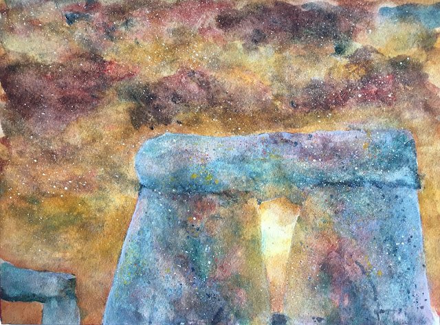
A Moment At Stonehenge
It was supposed to be the start of the big heatwave today but for most if the day it’s been exactly the opposite. For the first time since I had the air conditioning installed, I didn’t need it switched on. I just worked in the studio with the window and doors open and everything was perfect for painting. Except that I thought I’d better not have music on with the doors open.
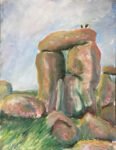
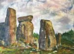
I wanted today to try out some of the ideas from the Catherine Beale book. For subject matter I picked out two different Stonehenge photos: one with this arrangement of stones and one with a very orange sky and the sun shining through the stones and the clouds. For colours, I picked out Indian yellow, rose dore and Mayan blue genuine and threw in viridian for a bit of fun and hematite violet genuine for texture. With viridian playing a role as a second cool blue, this is in the key of orange cool. Titanium white also ends up playing a key role and cadmium red and cadmium yellow appear at the end as garnishes.
After putting down a pretty basic pencil drawing, I put down a very watery underpainting. I used all five colours in this but with half an eye on the final result, trying to get lots of red and yellow into the sky, hematite violet over the stonework and yellow and empty paper around the sunburst.
The second layer was much more careful, sticking to the boundaries in the linework, trying to make the sky orange and colouring the stones with blue, red and green in mist places but yellow around the sunburst. After putting this layer down, I put some screwed up clingfilm over the stones and weighed it down; this gave some pretty good effects, even if they ended up hidden by subsequent layers. I tried to add the odd dark cloud in the sky and to lift paint to give a sunburst through the clouds.
There were several more steps in my process after that, just as there are several in Catherine’s process, but I think of them all as tinkering. I added a two or three more layers to the sky, first trying an orange glaze (red plus yellow) and dropping in some dark clouds, then trying to make the orange shapes more orange and the clouds darker. For the stones, I alternated between adding more colour to darken them and trying out my new trick (and my own invention) of applying white paint around the edges of the stonework (not too thick but also not too watery), softening it with water and then dabbing it off: it didn’t just make the stones look more like stones but it also contrasted them against what was quite a dark sky by now.
Once I was happy with this tinkering, I moved into finishing touches. I added some shadows and cracks in the stones, with a mixed neutral colour at first but later with the blue. And I added white spatters everywhere and yellow spatters (with the opaque cadmiums) only over the stones. And that was me done.
The final verdict? Well, there are two questions really. Did I achieve what I set out to achieve? And is the final painting any good? The answer to the first question is no. There’s not as much orange in the sky in places where I wanted orange, not enough yellow where I wanted yellow and not enough empty paper where I wanted white. I’ve not been fast enough dabbing paint away from the sunburst and I suspect I’ve been letting other colours contaminate my yellow and red. And do the stones look a bit too two dimensional? On the other hand, I think the painting’s a success. I’ve caught some light in the sky. Even it doesn’t show up in the sky outside the arch, it does show up on the stones and that’s far more important. And there are also some good blue/orange complementary contrasts going on. It’s starting to grow on me. This one’s up for sale.


Leave a Reply