I wasn’t very good at painting and not that committed to improving. I would have…

A Miserable Night In Torquay
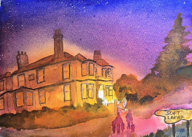
I still have three new books sitting on the shelf and it would be very easy for me to stop painting for a month while I read them all. But then I wouldn’t get as much out of the books as I would if I painted in between and tried out some of the new techniques I’ve been reading about. So, first up I thought that, after reading Joseph Stoddard’s book on Expressive Painting, I really needed to paint a rainy night scene while the lessons were still in my head.
I picked Torquay’s most famous hotel as my subject with the “stretch objective” of making it look welcoming. I started by sketching it out in pencil, then drawing over the pencil with a cheap waterproof rollerball. I then plonked on an underpainting with some white space in the middle, surrounded by Indian yellow, surrounded by quinacridone magenta, surrounded by French ultramarine. And then I went over the underpainting a second time – as I said in the book review, Stoddard likes to lay it on thick.
And then the rest was tinkering, using my three primaries plus burnt sienna, sepia and titanium white. So I added trees and foliage, shadows on the building, people, etc. And I coloured in the roof, chimneys, external features and some of the windows. And you can see how I’ve splattered some stars and added a sign.
There’s so much that works about this one. Stoddard’s ideas about nighttime painting are brilliant. I should try this again at some point. I’m pleased with how I have some of the shadows working on the building. And, for the first time in a while, I’m really happy with the trees and foliage – adding a bit of red worked out well, as did choosing carefully where to add the yellow to bring out the light.
What don’t I like? Well, the reflections in the road aren’t working yet. And the people in the foreground don’t harmonise with the rest of the painting, despite being painted in French ultramarine and quinacridone magenta. Maybe I needed to add in some of the yellow too, and maybe not make the people monotone. But the biggest problem with the painting is the signpost. With the hotel in the background being in focus and the people in the middleground being more blurry, the sign should definitely not be in focus. Oh well. When I come to frame this one, I’ll be cropping out the signpost, even if it means losing the tree.
This one’s for sale provided I can get hold of a 9 inch square frame. To see the price, click here.


Leave a Reply