


Having learned my lessons, here's my second attempt of the day. There are only three…
A Haunted Island
I’m taking a day off from serious watercolour painting today and going back to abstract landscapes. I’m going back to the palette knife technique that worked so well in Still Raining Still Dreaming a while back.
Because my colours will all come direct from the tubes, I didn’t get the Mijello palette out today, instead reaching for the plastic takeaway tub in which I keep my opened tubes. And I squeezed colours out direct onto the shelf on my easel as it’s supposed to function as a plastic palette. The colours I used today were:
– Daler Rowley pthalo blue, a colour I wanted to try in the past but that doesn’t have a place in my main palette
– cobalt blue, ditto
– light red, which was once the warm red in my palette but has since been replaced by rose dore and Winsor red, speaking of which
– Winsor red, which has been short of action recently and deserves an outing
– Indian yellow as I wanted a bright yellow and the alternative, transparent yellow has been overworked recently and needs a break
– burnt umber, the forgotten colour on my palette, desperate for any action
– viridian, a colour that makes the odd appearance but could do with a bigger role
In fact, with both reds being warm and both blues cool, this painting could claim to be in the key of orange cool.
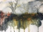
I started today by painting in three birds using masking fluid. I thought these might look good as white shapes against a colourful background. And then I just followed the usual process for this sort of painting: I scraped on paint with a palette knife, squirted on some water and tipped the paper around a bit to get the colours moving. One side of the painting started to look like trees and I used a brush to create extra branches for the paint to flow down. A shame that I’d put in those birds and that the birds are one way up and the trees the other.
And then it was all tinkering. Using a brush to turn paint marks into a sky, sprinkling on salt, dabbing with a kitchen towel. The lesson from Still Raining, Still Dreaming about leaving big white spaces just hasn’t sunk in.
At this point, the bottom of the painting was looking like water but with reflections that didn’t match the rest of the painting. I’d been hoping that the things that looked like trees might end up looking like roots but things hadn’t worked out that way. So some corrective action was necessary. What I did was to add some hilly glazes over the top. I did a lot of tinkering with these glazes, charging in extra colours, dabbing with a kitchen towel and throwing on salt.
When I was happy with the foreground, I left the painting to dry. I rubbed off the masked birds but rather than leave them white, I made them more realistic by adding dark bits.
Overall, this is an interesting painting. Are there two layers of hills? Two layers of water? Hills and water? Water and hills? It’s all a bit ambiguous, not helped by the presence of seagulls and the name of the painting (which comes from an Algernon Blackwood short story today). The shape at the bottom of the painting has flesh tones and could even be interpreted as a naked body or two naked bodies. This one raises so many questions. It’s up for sale.

Leave a Reply