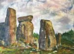
It's June 21, the Summer Solstice, so I'm back to Stonehenge again. In a lot…

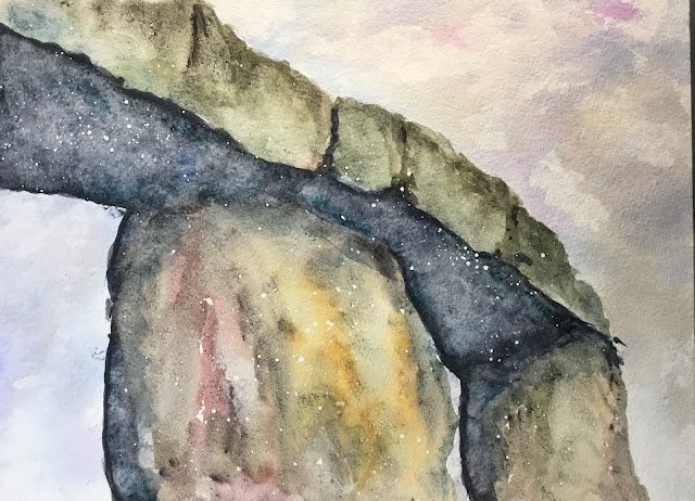
A Corner Of Stonehenge
This was always going to be today’s painting after all that fun testing out my Daniel Smith colours yesterday. It’s two days to Summer Solstice too, so I might try another Stonehenge painting on Tuesday.
There was no limited palette or colour key today. I just identified my favourite granulating mixed as hematite violet either on its own or mixed with green apatite genuine, viridian, Prussian blue, Mayan blue genuine, cerulean blue, French ultramarine, rose dore and Indian yellow and came up with a plan on where each of these would be used on the stones in the painting. For the sky, I decided to use French ultramarine, quinacridone magenta and transparent yellow as these make for quite a realistic looking sky that wouldn’t distract from all the colours in the rocks.
So, having planned the colours and again coming up with a value plan, I started with the pencil drawing. I then used masking fluid to protect the rocks around the very small sky areas between the two vertical stones. I spattered on some masking fluid for extra texture. Once this had all dried, I rubbed off any spatters that I could see in the sky shapes as I didn’t want any white spots there.
The first paint on was the sky. I carefully wet all the sky areas, being careful not to leak into the stones. Then I put in lots of French ultramarine and added a bit of quinacridone magenta and transparent yellow in places, being careful not to create any greens. And then I dabbed at it with a piece of screwed up kitchen paper. I’ve got skies absolutely nailed.
Then onto the stones. I started with the light areas on the horizontal stones, where I used the two mixes of the hematite with cerulean blue and with my two greens. Later on I tinkered by adding in some other mixes, the mix with rose dore in particular. In all these washes, I would start by painting in the top outline, filling the shape out with water, dabbing out some colour and charging in some drier colour in places.
Next came the big shadow area, which I painted on with the mixes of hematite with my Prussian and Mayan blues. It all looked a bit light and a bit unrelated to the light side of the stones (maybe I should have started with an underpainting covering both the lit and shadow sides), so I did some tinkering later. I added a second coat using both blue mixes, dabbed it a bit with kitchen paper and dropped in pure versions of both blues and the mix of the hematite with rose dore. I ended up with a spacey look, which I decided to keep, knowing that the masking fluid spatters would end up looking like stars, making everything a bit mystical and summer solsticey.
And then I did the vertical stones. In the most well lit parts I used the hematite neat and mixed with rose dore and Indian yellow. In other places, I used all the other mixes.
And that’s where I stopped. Not after finishing the erotically stones but after finishing fiddling about with the shadow area. Once everything was dry, I removed all the masking fluid spatters.
I’m really happy with this one. The colours in the sky and on both the lit and shadowy sides of the stones are great. If there is a problem, it’s that the shadowy side of the stones still looks a bit disconnected from the lit sides, but I can always claim this was deliberate and all to do with there being a window there to the great expanse of the universe. This one’s up for sale,
Despite managing to achieve all these granulating effects using the hematite violet genuine in mixes, I can definitely see the attraction of those super granulating Schmincke sets. They save a lot of hassle repeatedly mixing colours while trying to keep the proportions consistent and keeping the mixing area organised. They’d be a luxury rather than a necessity but the tundra version (or maybe forest or desert) would make an interesting surprise present if any of my family are reading this.


Leave a Reply