Today I've been painting Hale and Pace, a comedy double act from the 1980s and…

A Clockwork Orange
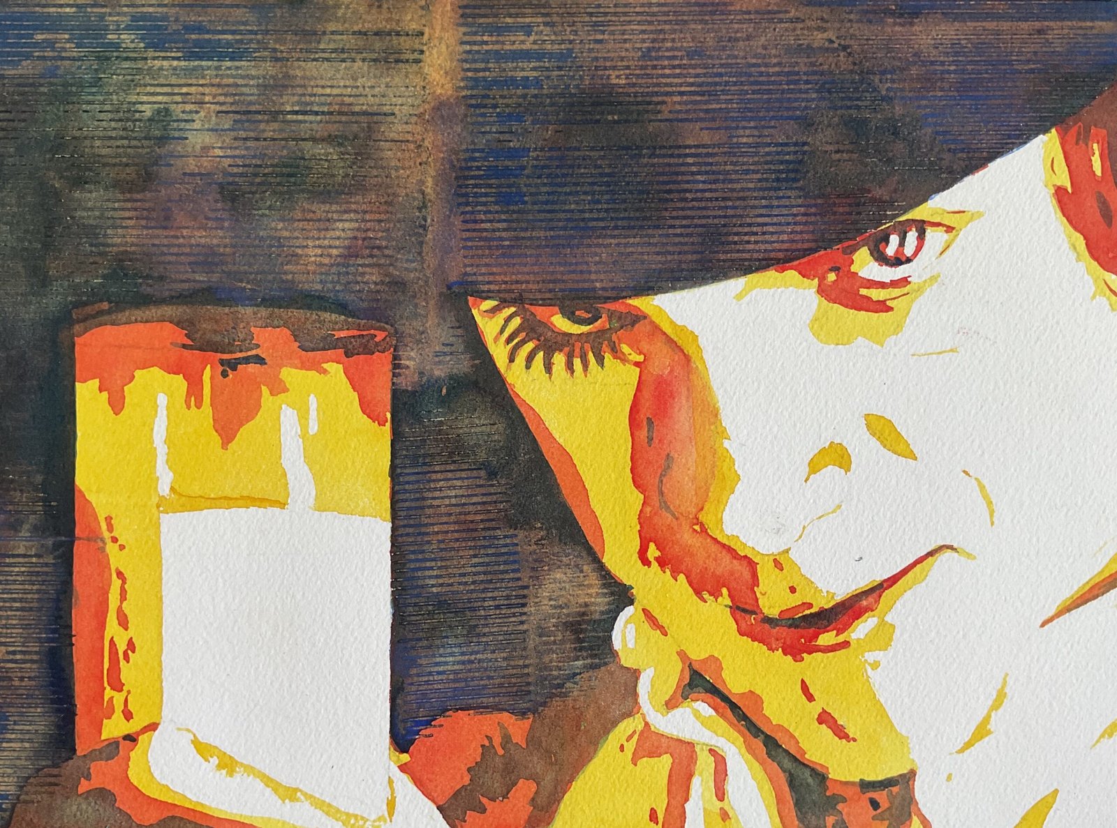
Another watercolour today. This is based on a publicity shot for A Clockwork Orange, a famous 1971 Stanley Kubrick film. With the white face and glass of milk and the dark eye makeup and hat, this was begging to be put through the Notanizer app and painted in three glazes, so that’s what I’ve done today.
With orange in the name of the film, I thought I should paint this using my amber colour scheme. So the highlights were left white and I painted over layers of transparent yellow, Winsor red and French ultramarine in the areas recommended by the app.
I did do some fiddling to the end today though. I noticed some pencil lines within the white shapes that I didn’t want to rub out and forget because I thought they were important in separating different highlighted areas. So I added some more of the yellow in those places. It’s separating the thumb from the milk and the neck from the chin and there’s a curved line above and to the right of the mouth. I think they all add something rather than taking something away.
The other bit of fiddling I did was with the blue. After I added the blue layer, my darks were looking too brown for my liking and I wanted them to look more blue, or at least black. So I added another layer of the blue. In a couple of places, I left the original third layer untouched without the extra blue, to help distinguish between adjacent dark ares – you can see brown areas on the shirt and hand and on the top of the glass where I’ve done this. And on a whim, I dropped granulation medium into this final blue layer and, worried that it might cause cauliflowers, put on some more pieces of the ridged cardboard box that I used for the Avengers paintings and weighted it down for a couple of hours. And that was me done.
I’m happy with this one. It would be easy for that huge dark area to look dull and boring but the granulation medium and ridged texture have done a great job there in making it non uniform, even if it’s obvious that I’m using a number of separate bits of box rather than one big sheet. And I’ve managed to capture the sense of menace, which is the most important thing. This one’s up for sale. To see the price, click here.


Leave a Reply