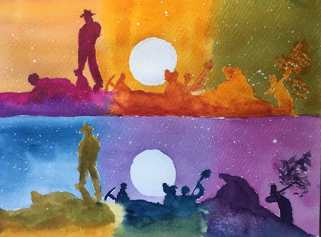
This was quite quick to paint but took me all day to plan, so let’s talk about planning first. I’ve had an idea for a while about doing a painting made up of six mini-paintings where one has sensible colours and the other five all have colour schemes that are rotated 60, 120, 180, 240, 300 degrees from the starting scheme. The hardest bit is coming up with a suitable starting subject. I needed something made up of simple shapes and that has a nice simple starting scheme. The only ideas I could come up with were boring ones with sky, foreground, house and tree, maybe in simplified abstracty shapes. But Inthoughtbthis might look a bit childish (that’s not to say I won’t try this at some point though). So I flipped through my collection of painting idea photos and found a shot from Raiders Of The Lost Ark. The big attraction in this one was the small number of shapes. But rather than six sub-paintings, this was better suited to two sub-paintings, with each sub-painting having three colour schemes.
Next step in planning: the colour schemes. I put the main colour scheme (yellow sky, orange to red foreground) in the middle of the top painting because it was so important and because this allowed me to have three daytime colour schemes along the top and three nighttime schemes along the bottom. The other choice to make was whether to use a 123, 456 or 123, 654 ordering. The second goes around in a circle whereas the first reads left to right. I went for the first as it meant there were consistent relationships between colour schemes that were above and below each other.
Right, we’re starting to get somewhere. What colours to use. I wanted to use a triadic colour scheme so that the six sub schemes could be equally spaced out around the wheel. I chose a triadic left scheme (Indian yellow, Prussian blue, quinacridone magenta) because the sky in the still I was working from was a very warm, Indian-looking yellow.
After this, the painting was quite quick. Masking fluid first then the sky, then the silhouettes. For texture, I used masking fluid spatters in the sky and salt in the silhouettes. I left the sun in the top painting and moon in the bottom painting white – it felt like the right thing to do. Job done.
Let’s talk first about what isn’t perfect. The sky in the bottom right and maybe the silhouette in the top left should be red but are maybe a bit too purpley. The silhouette shapes aren’t exactly the same. And the spray of sand flying off the spade on the far right of both paintings isn’t great. There’s also not as much blending between neighbouring schemes – it was a hot day today and the paint was drying inconveniently quickly.
But otherwise this is a great painting. It feels not like a journey through a rainbow but a journey through a long, hot working day. The contrast between the top and bottom paintings works, with the big white circle looking like the sun at the top and the moon at the bottom.


Leave a Reply