Oil pastel paintings are (for me, for now) faster than watercolours, so are the ideal…

Frank’s Wood, Leith Hill, Surrey
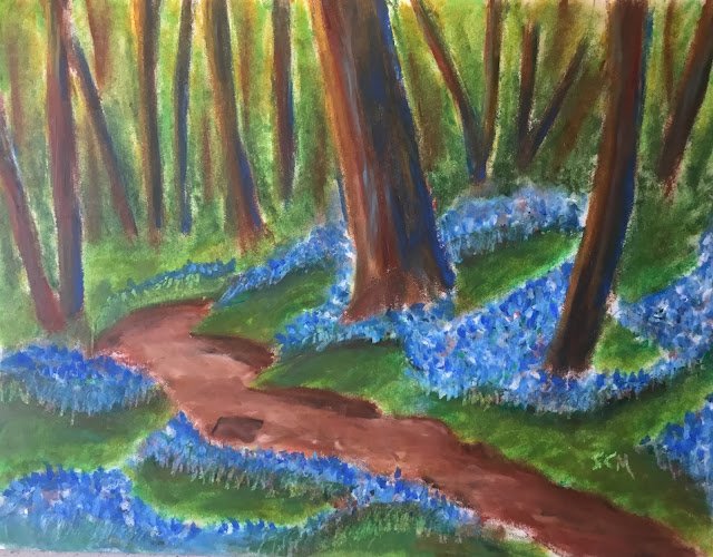
It’s getting cold and wet outside so the number of watercolour and oil paintings that I’ll be doing the rest of this year is numbered. Today I fancied having a go with the oil pastels. This is my first go with the bigger, 12 inch by 9 paper. It’s a scene in Frank’s Wood, inspired by a photo by David Hall that I probably found on the BBC News website. I’m trying to track David down but have had no luck so far. The David Hall photographer whose work this most resembles tells me the original work is not his; there’s another David Hall photographer who I’ve tried to contact but with no luck so far,
Painting on this size paper is much easier and more fun. It’s all less fiddly. I can just get on with the painting. I started by adding in rough lines with one of the pastels, then vaguely shaded in the trees, path, grass and bluebells with the sides of four appropriately coloured pastels. And then I just went out and enjoyed myself. For each of those four types of shape, I picked out at least three relevant colours from my box and dotted them in. For the path and the greens, some places were lighter than others and reflected this by using different colours in different places. Then I used my fingers and some tools to mix the colours together on the paper.
This gave me an underpainting. This was never going to be the final result as I wanted some texture in the bluebells. So during the next stage, as well as adding more colours to the trees, path and greens (in particular in any areas that were short of colour and too white looking), I dabbed in some bluebells with the intention of keeping them as dabs rather than blending them together. I did end up blending some of the more distant bluebells, but that’s just sensible: you can’t have both the foreground and middleground in focus. I also did a little bit of scraping underneath the bluebells in places.
When I stepped back, I thought the painting didn’t hang together, with the trees, path, bluebells and greenage looking like a disconnected team. So I added some blues to all the tree colours and suddenly everything looked better again. The trees, bluebells and greenage definitely all work well together but I wonder whether I should have added any more colours to the path.
Anyway, I rate this one a success and it’s up for sale. To see the price, click here.


Leave a Reply