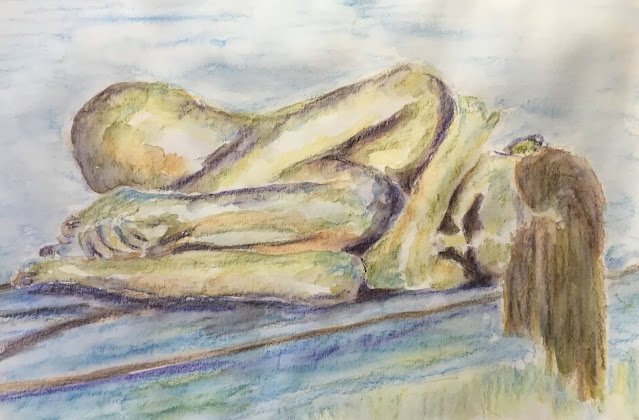
Back to the figure drawing with the inktense pencils today. I've been doing a lot…

KylieB
I have a new model today. This is KylieB. I thought she looked cold in the source photo, so I thought I’d make the photo cold too and avoid all my reds.
So for colours, I started with willow in the darkest areas, then leaf green, then mustard. I thought at this point I needed some more dark areas that weren’t green, so I brought in baked Earth. Then I filled in the background with iris blue and sea blue, which looked like the two coolest blues in my set. I marked in edges and creases with willow, I also threw in some mustard in the foreground just for the hell of it. I decided at this point I needed some blue in the figure, so I spotted in some little bits. I also wanted something in the figure fighting back against the cold and didn’t want to use reds, he’d for the purple and added this in the darkest places.
I then added the water and realised that the purple was a mistake. So, after letting it dry, I added some bark to all the darkest areas and added the water. This improved things slightly.
Still, it goes down as a marginal failure. There’s some great mixing and cauliflowering going on in places but the background is too uneven and pencilly and the darkest bits don’t blend well enough into the lighter bits – they have sharp borders and look too much like outlines. I’ve also realised that I’ve dropped a good habit that I need to bring back again. In my best figure drawings, my water strikes have been following the curves of the body, adding volume. But for some reason I’ve stopped doing this. My water strikes have all been applied with a colouring in mindset rather than a sculpting mindset. I need to stop doing this. I’ve written an instruction to myself on a piece of paper that I’ve put in with my pencils. My next figure painting will be much better.
Anyway, yes, this is a flop and doesn’t go in the shop window,


Leave a Reply