I wasn’t very good at painting and not that committed to improving. I would have…

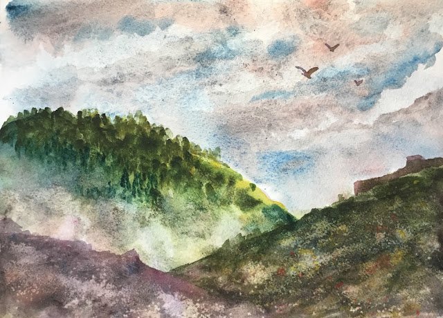
All Along The Watchtower
Let’s start off with the important news. I’ve been rejected by Landscape Artist Of The Year 2023, so won’t be in a pod. But I’ll be applying for a place as a wildcard. They open for applications at 12 tomorrow and I’ll be applying immediately. It would be good to get in. A day out as a wildcard is amazing.
With filming starting in June, I thought I’d better start getting some practice in. Today I’ve gone back to standing up at an easel rather than sitting at a table. Tomorrow afternoon, I may start getting in some plein air practice around the village or maybe somewhere else.
With today’s paintings, the objective wasn’t to create masterpieces but just to have fun and to recapture some mojo but let’s wait and see. For the first painting, I wanted to give all my granulating colours a good workout, partly motivated by how I’ve finished my cool press block and, until I buy another, will only have rough to work on.
Colours in this one were Mayan blue, French ultramarine, cerulean blue, cadmium red, hematite violet genuine, viridian and green apatite genuine (all granulating) and quinacridone magenta and transparent yellow (non-granulating) with cadmium yellow making a cameo appearance at the end. With warm and cool versions of both reds and blues on that list, it obviously wasn’t painted in any particular colour key.
I had no real plans for this one apart from it being a random landscape. I started with a sky made up of cerulean blue, Mayan blue, cadmium red and hematite violet genuine. This is the heaviest lifting cadmium red has done for a while; I used it with the hematite violet in the clouds. I dabbed a bit at the sky with kitchen roll before it dried. As well as making some lighter cloud shapes, it did help withbt(e granulation and textures.
For the hills, I started while the sky was drying with a layer of the violet hematite genuine because I wanted to see some of that spotty black granulation in areas that I left empty. And then I added all the other colours. I made one hillside quite bright with the transparent yellow to give the impression of sunlight. The purple tone to the nearest hill shape is down to me missing the hematite violet pan and loading up with quinacridone magenta. It was never my intention to use the magenta but it looked good, so I kept using it. The shape of the hill on the right had too many straight lines at the top, looking like some sort of fortification, so I turned it into one. When the paint makes a decision, you have to go along with it. And textures were created with salt and kitchen towel dabbing.
I wasn’t happy with the two hills on the left. They had similar values and were barely distinguishable to the screwed up eye. This is why I created the fog in the valley by wetting the paint, dabbing it out and gardening the top edge of the nearest hill. The trees on the hill weren’t great either. They were mainly made up of green apatite genuine. But after stippling in some transparent yellow on the right and at the top, dabbing in some Mayan blue trees on the left and fogging out some of the lower trees, things looked better.
To finish, I added some birds using a neutral colour mixed from all the colours that I had sitting around and dabbed in a tiny bit of cadmium red and yellow. And I spattered in some cadmium red and cadmium yellow but only on the hill on the right as the hill in the bottom left was already looking quite good with its rocky colours and texture.
I don’t mind this one. It has atmosphere. It feels like the morning after a battle. Not quite good enough for the shop window though. The painting was always going to share its name with either an Algernon Blackwood short story or a Jimi Hendrix track; it was quite easy to pick a name from the list today.
Oh, and as a special bonus, here’s a photo of the paints in my palette partway through this painting. Those Daniel Smith colours are out of control – just look how they granulate just on plastic!


Leave a Reply