This was always going to be today's painting after all that fun testing out my…

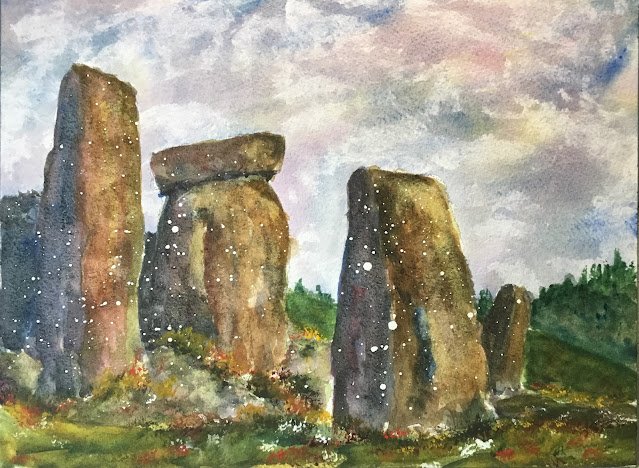
Another Corner Of Stonehenge
It’s June 21, the Summer Solstice, so I’m back to Stonehenge again. In a lot of ways, this followed a similar process to my previous painting, but there were some differences in approach.
Let’s talk colours first. I used:
– French ultramarine, quinacridone magenta and transparent yellow in the sky, just like last time
– French ultramarine, transparent yellow, green apatite genuine and a little bit of quinacridone magenta in the greenery (there was no greenery last time, only a starry background)
– mixes of hematite violet genuine with Indian yellow, rose dore, green apatite genuine, viridian green, French ultramarine, cerulean blue, Mayan blue genuine and Prussian blue (just like last time) but this time on top of an underpainting of French ultramarine, quinacridone magenta and transparent yellow
– some finishing stabbing of cadmium yellow, cadmium red and titanium white (new)
Just like last time, I started with a pencil drawing, spattered on some masking fluid, let it dry, then rubbed off the biggest spatters and anything that didn’t land on a stone. Admittedly some of the shapes that were intended the bits of stone at the bottom of the columns ended up as grassy knolls and you’ll see some white spots in these.
Then I painted in the sky, dried it with kitchen paper and painted in the background greenery. The sky came out great (I’m on a roll with those three colours). The greenery was more tricky though. The furthest hill on the right still isn’t quite right (and it should have been trees on the closer hill, not a separate hill) but I think I reached something acceptable after throwing in some of the magenta to tone down the greens.
Next it was the stones, and a change of technique from before. This time I started with an underpainting made from my three sky colours. The aim was not just to “colour the light” but also to look for some harmony between the stones and the sky and between different valued shapes on the same stones. Then I followed a similar process to last time by painting in the stones using various different hematite violet mixes. This time, I tried to blend the shadowy and light areas of the stones together, which I think I managed to do. But I also put on several layers of paint, which means there was a lot less granulation within the stones. If I’m planning something similar in future with multiple layers of paint, I should probably stick to using whatever three primaries colours I’ve used in the sky rather than wasting the hematite violet genuine.
Then I painted in the foreground with a bit of shadow and stabbed in some life with the Merlin brush and the usual three opaque colours. As I mentioned earlier, some of the stones at the bottom ended up as grassy knolls and I think they look good. Better than they would have done as stones if I’d tried to paint every small shadowy detail. The shadow along the bottom doesn’t make things look particularly sunny because I don’t have any highlights or light values on the stones or the foreground.
And finally I rubbed off the masking fluid spatters. I’m left wondering whether I should have wiped off any spatters on the shadowy sides of the stones. The idea of leaving them on was to make them look like stars against the shadows behind them, but the multiple paint layers that wiped out the granulation also took away that spacey feeling.
Overall, I rate this as a success. The stones are looking out at something. It’s a shame the granulation isn’t there but what the eye don’t see the chef gets away with. This one was sold at the 2022 Upchurch Art Exhibition to someone who said it reminded her of Outlander, a TV series and set of books where standing stones are gateways into older time periods. So there’s definitely something in the atmosphere in this one.


Leave a Reply