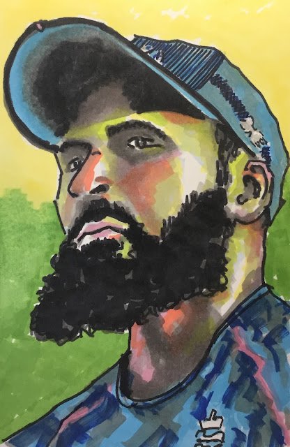
More cricket portraiture with the markers today. I'm going to continue with cricket portraits until…

Adil Rashid
My third successive cricket portrait and they’ve all been in different media. Today it’s the first outing for markers since last winter. I picked out a photo of Adil Rashid to work from. He’s a member if England’s World Champion T20 cricket team and his economical bowling in both the semi and the final were indicative of a player who steps up for the big occasion. It’s his beard that made me reach for the markers: to paint a beard like that in any other of my media would require a lot of texturing skills which I don’t really have, so they were a no brainier.
To get my initial drawing down, I again used a grid and drew upside down. I’m going to keep doing this. I know I said at one point that I’d be abandoning the grid. I’m going to backtrack on that though. Now my ambition is to complete a whole painting (not just the initial drawing) upside down. I’ve seen Liz Chaderton do this on YouTube and the result looked amazing.
Anyway, back to today. After putting down the pencil drawing, I put Adil the right way up for adding colour. I started, as I always do, with quite a dark grey in the darkest areas, then lighter greys in slightly less dark areas. Next I add colour in the clothes. Then there are two things that happen in parallel in the third stage: I add impressionistic colours to the face and start to add darker colours and even blacks to those dark areas that I’ve already started on. Finally, I add a background and (at least today) some outlines.
The best thing about this work is the look in the eyes. The Jos Buttler painting showed fear in the eyes but this one shows a focus and determination. The likeness is also better in this painting than I managed to squeeze out of Jos or Beefy. The colours in the flesh are interesting to say the least. I could have stopped earlier with only six shades of grey in the face but couldn’t resist the temptation to teach for the pinks and the orange that I could see in the source photo. At one point I thought the impressionistic colour might ruin the painting but in the end they made it stronger. This seems like much more adventurous use of colour in flesh tones than I’ve ever put down before with markers. Anyway, where was I? Oh yes, the worst thing about this one is the black outlines that I’ve added – I could have done without them.
Overall, I think this one’s pretty good. Adil’s up for sale. To see the price, click here.


Leave a Reply