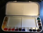
My second job was to load up the Mijello palette that I got for Christmas.…

The 2023 Colour Palette
This week I’ve been thinking about the colours in my watercolour palette. My 2022 palette included three Daniel Smith primatek colours as special guests and they’ve been under trial throughout 2022, looking to earn themselves long term squad places. So how did they get on?
Well, first up, there’s the Mayan blue genuine, a sparkly dark blue with hints of both green and indigo. I think it’s an amazing colour. It’s trial has been successful and it’s earned its place in my palette.
Next we come to haematite violet genuine. An interesting colour, mainly for its special effects when combined with other colours and granulating all over the place. It’s expensive though and seems a bit short of pigment, running out really quickly. When my tube’s empty I’m going to be giving potters’ pink a go. It has the same granulating effect on other colours, which is why it features in so many of the Schmincke supergranulating colours. Those two colours are competing for one place.
The third primatek colour was green apatite genuine. It’s a colour I like, granulating into two different colours, but its thunder has been stolen a bit by the supergranulators. If I want that supergranulating effect then, rather than use my regular palette and throw in green apatite with a red, yellow and blue, I’d go for a set of supergranulators instead. And it’s not as if the green apatite could be used as an extra colour with those sets: it’s too green for desert and tundra and too highly pigmented for shire. So it’s with regret that I’ll not be replacing it when it runs out. Instead, Payne’s grey, which has been patiently waiting in the wings all this time, will replace it.
But there’s more palette news. I’m changing one of my colours. I keep hearing too many stories about Prussian blue having lightfastness problems. It’s been one of my colours right from the beginning but I’ve made the difficult decision to let it go. Replacing it is Winsor blue green shade (known as pthalo blue to most paint manufacturers). It’s a colour I’m looking forward to using. It’s highly pigmented and can look garish on its own or in mixes. It’s often referred to as an alternative to Prussian blue and I see it as the teenage version of an adult Prussian. One thing that Prussian can do that pthalo can’t is to achieve very dark values but this won’t be a problem as the Mayan blue genuine has the dark values covered.
All of this meant that my colour swatches from two years ago were looking an bit out of date. They were based on three reds, three yellows and three blues, so 3x3x3=27 different combinations. But of those 27 swatches, the nine involving Prussian blue were now out of date and I was missing 18 swatches featuring my two new blues. So it was time for a new swatching exercise.
I found this sketchbook on Amazon. Cold pressed cotton paper with the same weight as the paper I use and 48 long (24 double sided sheets). What’s not to like? I prefer double page spreads to single pages, so I’ve left the first and last pages empty, and then for the other 46 pages I have:
– 4x3x3=36 pages of swatches of blue/red/yellow combinations. So that’s (i) the Mayan, Winsor, cerulean and French ultramarine blues, (ii) Winsor red, rose dore and quinacridone magenta, (iv) raw sienna and Indian and transparent yellows. Cadmium yellow and red are in my palette but being opaque colours, only generally used as herbs and not as key ingredients, so are not included in these triad swatches.
– 2x2x1 pages of swatches of blue/red/yellow Artgraf combinations
– A couple of pages looking at what I can get from mixing viridian with different reds (including burnt sienna and cadmium) and mixing burnt sienna with blues (including Payne’s grey)
– Three pages of swatches of my Schmincke supergranulating sets and a fourth page ready for the forest supergranulators if I end up replacing the Shire supergranulators with these.
On all of my triad swatch pages, I have four big blocks of colour where I’ve tried to mix a number of different greens, purples, oranges and neutrals. There’s lots of variegation in all those boxes. And on every page (not just the triad swatches) there’s room for me to make notes, and I’ve copied some of these over from the old postcard swatches and from my notes on colour keys.
I took a lot of time over these swatches. Not much choice in the matter when using a sketchbook rather than postcards, but I still took more care than before. The whole swatching exercise took three days! I screwed up one page and had to Pritstick some corrections over the top, which was a bit annoying. I’d be lying if I said the thought of redoing everything all over again hadn’t tempted me. Anyway, I’m expecting this sketchbook to be part of my arsenal for a good few years.
<Edit: I later decided that green apatite genuine would be a good addition to my Shire supergranultors. It’s darker than the Shire colours but they need some dark greens in there for trees, otherwise they’re only suitable for rolling hills>


Leave a Reply