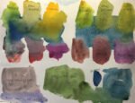
When I talk about my choices of colours in paintings, I seem to refer quite…

Messing Around
It’s been a whole week since I last posted. Sorry about that. Too much other stuff on. Choosing a bathroom, choosing blinds, attending an 80th birthday party, visiting parliament to hear a paper being presented. It’s been all go. Once this post’s been published, I think I’m heading back indoors to sand down some skirting boards.
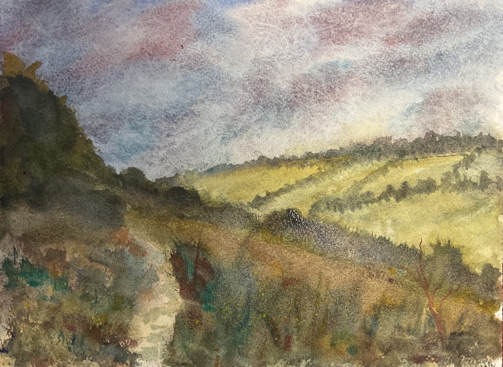
After a break, I like to bring myself back gently, and this often means a figure using the Inktense pencils. But today I thought I’d come back with a loose watercolour landscape. The scene is one from Queendown Warren. I didn’t draw this on the paper in pencil but just went straight for the paint and created all the shapes by eye.
Colour-wise, I went for French ultramarine, Mayan blue genuine, cerulean blue, cadmium red, virudian and raw sienna for their granulating properties, quinacrinone magenta because one red didn’t feel enough, Indian yellow for it’s saturation and warmth and a bit of cadmium yellow the end. But I didn’t use any of these colours (apart from the cadmium yellow) without mixing them with Potter’s pink first: the idea was to make this painting all about Potter’s pink and how it makes other colours granulate.
I vaguely worked from the front to the back, adding in whatever colours felt right at the time. The sky only needed one layer of paint but there are multiple layers everywhere else. I remember using lots of Indian yellow in the far hills because the other side of the valley always looks yellow to me, but otherwise there was no particular colour plan. For once I found myself with lots of messy neutral colours on the palette and dropping in extra colours to move the neutral in a particular direction on the colour wheel. I just messed around really. And once I’d reached a point at which I was holy, I stopped.
This was all very loose and unplanned today and the Jimi Hendrix track that I named it after seemed appropriate. With the sort of messy palette I had today, there’s a thin like between grown up unsaturated colours and mud and I think I managed to stay on the right side of that line and end up with something presentable. There’s a good composition going on too, with four or five lines radiating out of a point roughly one third in from the left and one third down. And the darker values in the foreground help the background recede despite the colours there not being particularly blue.
This one was sold while on display at the Rose & Crown.
<This is one of a number of local paintings that have been lent to the Rose & Crown in Hartlip to display on their walls. It remains up for sale whether via me or via the R&C. There’s no price difference.>


Leave a Reply