I have lots of different excuses for getting new art instruction books. I get books…

The M2
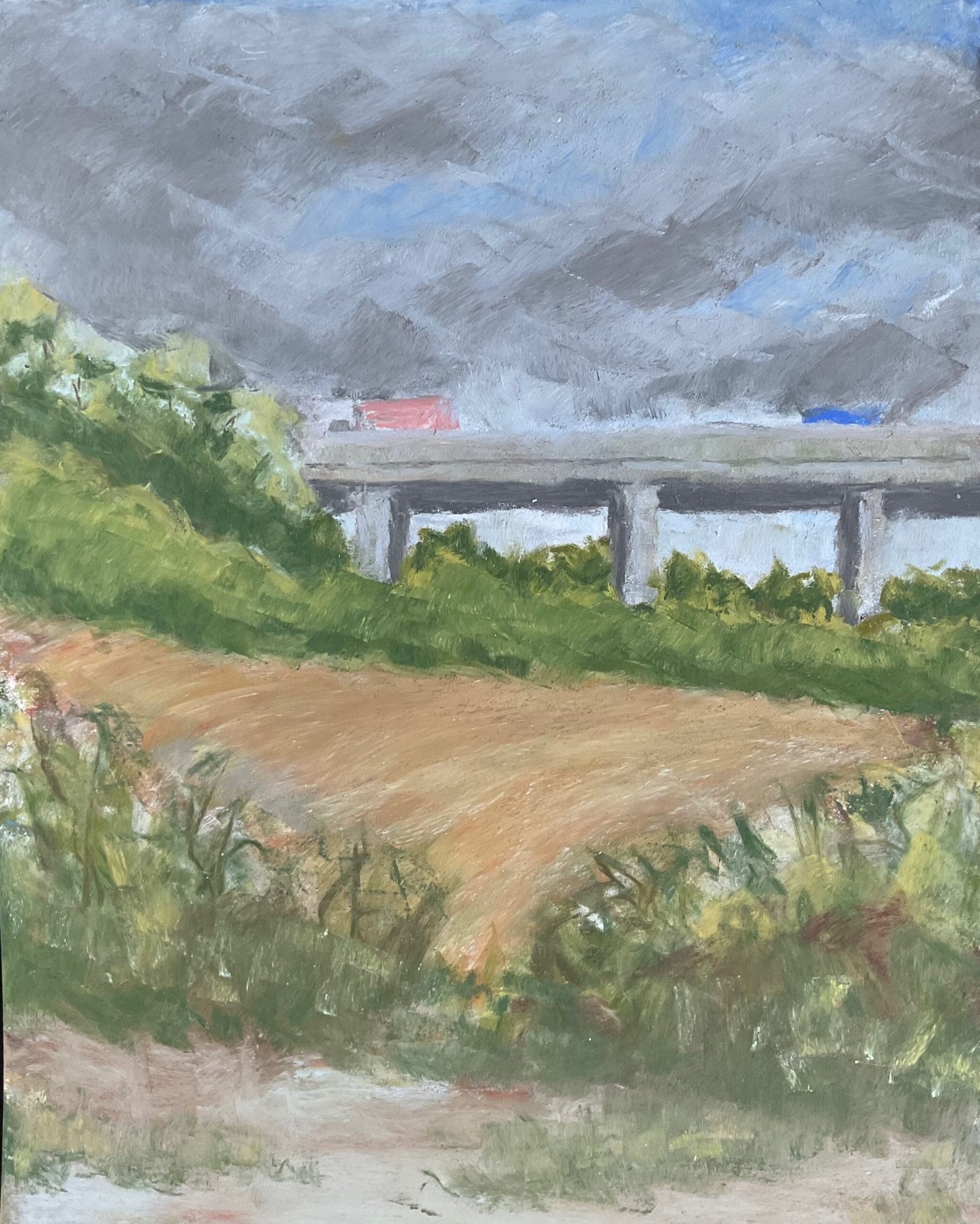
It’s another soft pastel landscape today. After yesterday’s success, I thought I’d have another go while my head was still buzzing with Robert Brindley‘s ideas. I wanted a scene with some colourless concrete in it. I don’t have enough colours to be able to paint a proper house and, while I do have enough for a plain scene with sky and hills, I’d feel too frustrated putting on local colours with so few impressionistic colours bailable to me. A boring concrete railway bridge though? Well, I have enough green, blue and fleshy colours to be able to inject just a little colour.
I had a source photo from one of my walks but, for once, made a lot of changes to it. I incorporated a bigger sky because I wanted to try out a characterful sky using Robert’s techniques rather than Sandra Orme‘s. I made the orange field shape in the middle taller, effectively changing the view in the photo to one taken from a greater height. I added a gap to the foreground hedge. And I made the road in the foreground slope downwards from right to left. Most of these changes were motivated by me wanting to incorporate a zigzagging eye route into the painting. The upward slanting pastel strokes in the orange field form another step in the zigzag. I also substituted in a sky from a completely different photo.
I’ve put down loads of layers of colour with the edges of the pastels, just enjoying myself and going with the flow. After a while I didn’t bother looking at the source photo. The sky in particular has a lot of layers to it. I found myself alternating between colourful grey and blue layers and plain white layers to tone things down. After I finally stopped, I blended the edges of the clouds with a colour shaper. The bridge was mainly greys but with the odd impressionistic colour thrown in at times. And for the orange field, the greenery and the road, I just kept reaching for whatever colour I thought would benefit the painting the most at the time.
When I was done, I stood back and took a look. Some of the bridge columns were too wide. But could they be corrected? I had a go and, yes, they could. Some sky colours over the bits of columns I wanted to lose and, bang, job done. It’s ridiculously easy to make corrections like this and it means I can do more drawing by hand without grids, knowing that if there are any problems they won’t be terminal. And I thought that was me done.
But then after writing up this post I decided that the sky was co letting too hard for tension, so dug out the painting, added another couple of layers of white to the sky and a little more grey and then stopped without doing any blending. The sky looks better now, and the clouds aren’t as dark as they look in the photo (which is of the final painting, after making those changes to the sky).
I’m calling this one another success. I like the colours in the bridge and how its wobbly edges give a shimmery look and the impression of humidity in the air. There’s also the zigzag composition and the way the (almost complementary) orange and green jar against each other. The mark making on all the greenery makes this somehow instantly recognisable as my work, even after only a handful of soft pastel paintings.
This one is up for sale. To see the price, click here.


Leave a Reply