


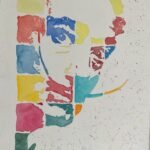
Before I get back to the paints, some portraits with markers. And after the Rush…
Jimmy Carr
Ever since I used dot cards to come up with patchwork portraits of Salvador Dali, Roger Waters and Sir Geoff Hurst, I’ve been thinking about doing a patchwork portrait using all forty of my non-white regular colours. Forty sounds like a lot. It’s made up of:
- The eighteen colours in my “main palette”
- The tundra, Shire and desert supergranulators sets, five colours in each, fifteen in all
- Green apatite genuine and forest brown, two dark green granulating colours that I use to supplement the Shire set if I’m painting a landscape
- The five colour M Graham landscape set
The MGraham set, like my main palette, includes a cerulean blue and burnt umber but, as these use different pigments to the Winsor & Newton versions, I’m counting them as separate colours.
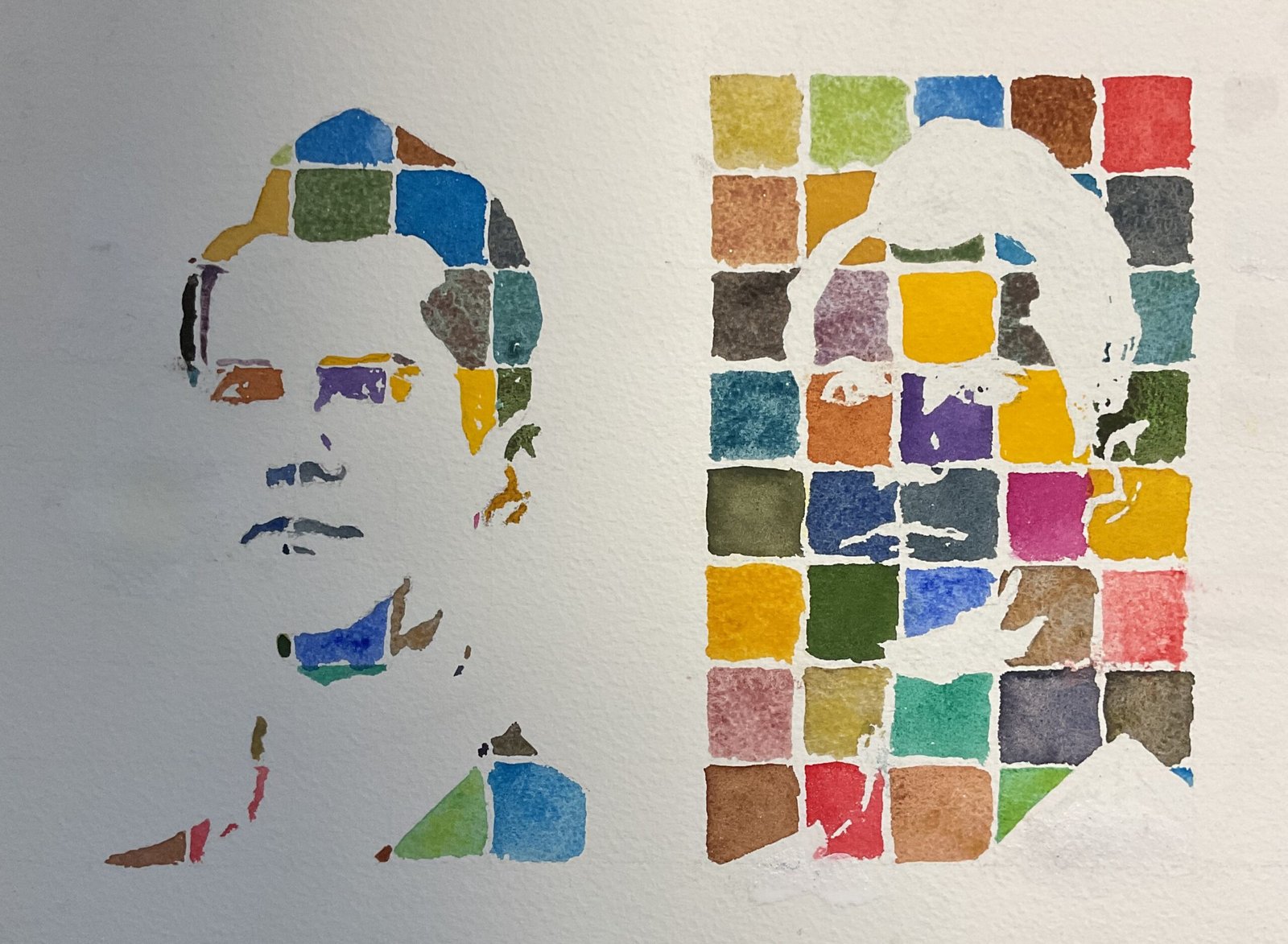
Anyway, today was the day that I decided to go for it. With forty colours available to me, a 5×8 grid was the obvious structure to go for but using a grid like this with the frames that I use would have meant either using non-square cells or having white gutters down both edges of the painting. This is why I decided to go for a landscape format and to paint both positive and negative images: together this pair of images fit the window in the frame perfectly.
Looking through my colours and sorting them into bunches, it became clear that by allocating pinks, purples and oranges appropriately, I could divide them up into five sets of eight; red, yellow, blue, green and neutral. Which was convenient as I could use one from each set in each row of the grid. I came up with a plan, allocating each colour to a different cell, with the order of colours cycling around as I went down the painting: you can see this cycling in the way the yellows, blues, etc occupy downward sloping diagonals in the final work. I also made sure that the two eye cells in my final plan were dark colours, so that the important details were clear.
My final plan looked like this, row by row from top to bottom, with MG signifying the M Graham honey based watercolours:
- desert yellow, Shire olive, MG cerulean blue, burnt umber, cadmium red
- tundra orange, MG yellow ochre, forest brown, Winsor blue (green shade), Shire grey
- sepia, tundra pink, Indian yellow, desert green, Shire blue
- Mayan blue genuine, raw sienna, MG dioxazine purple, cadmium yellow, green apatite genuine
- tundra green, tundra blue, Payne’s grey, quinacridone magenta, transparent yellow
- raw sienna, MG sap green, French ultramarine, desert grey, rose dore
- potter’s pink, Shire yellow, viridian, tundra violet, MG burnt umber
- desert brown, Winsor red,
I’ve not talked much about the subject in this one. I picked out Jimmy because of his looks. If there’s one person in the world who’s the perfect subject for painting using just black and white shapes (and quite large and simple shapes at that) it’s Jimmy. I don’t know whether he’s ever appeared on Richard Osman’s House Of Games but he’s well suited to the type of portrait that Richard used on his scoreboard.
Then it was on to the painting. I put down some pencil grids and drew in the shapes in Jimmy’s notanized portrait. I masked out all the shapes in the grid on the right but only a couple of highlights in the eyes on the left. Then I filled in all the colours. I worked with one set of colours at a time: yellows, then greens, then blues, then neutrals and finally reds. This was so that I could change the water after each set of eight colours. I filled in negative, unmasked areas in the cells on the right first, then used the knowledge from this to paint in the positive shapes on the left. Somehow I went wrong in a couple of places. A couple of erroneous yellows were impossible to lift out. I did my best but ended up painting white gouache over the top where the yellows were supposed to be white and didn’t worry too much in other places where I was painting green over the top anyway.
Once this was all done, I removed all the masking fluid, rubbed out any pencil lines and added the white gouache to cover any errors and accidental smears. And that was me done.
I’m not sure I’ve got the likeness right in this one, which is a bit disappointing as I thought Jimmy would be easy. Maybe it’s the way that one of the dividing lines goes through Jimmy’s eye shapes and cuts off bits that end up looking like eye brows. I like the portrait on the left, though. The colours have worked out really well there. I’m not so sure about the look of the painting on the right though. Some colours (the yellows especially) are highly saturated like Haribo and jump out of the page while the Schmincke supergranulators quietly sit back and do their thing. Maybe if I do this again I should narrow down my squads of colours. Anyway, Jimmy was great fun and I’m putting him up for sale for now.

Leave a Reply