I’ve caught up on my sleep now and can finally complete my three watercolours in…

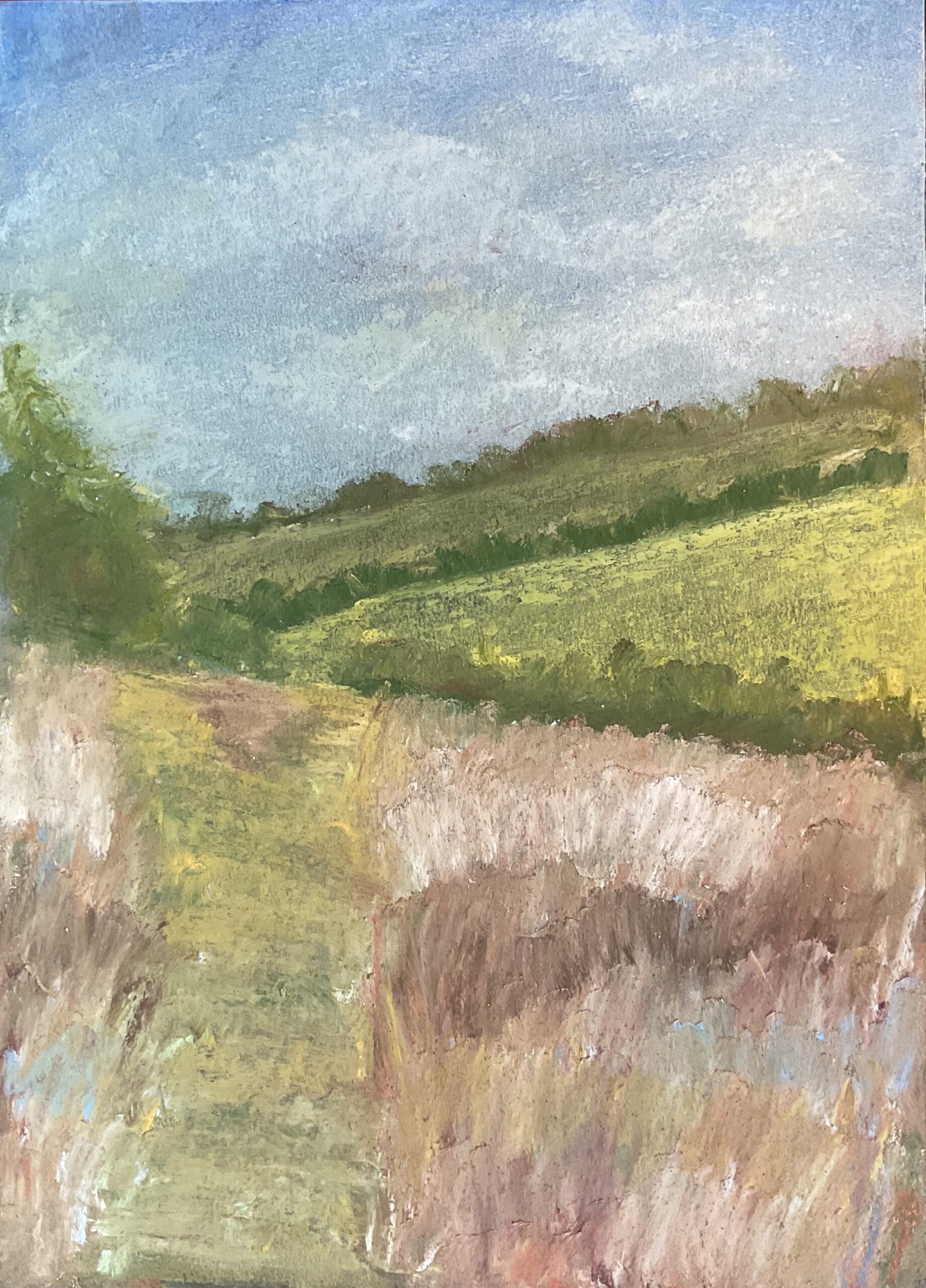
Towards Where Warren Cottage Should Be
I’m still trying to build up a reserve supply of paintings that could replace any that are sold at the Rose & Crown. After three successive days of watercolour, I wasn’t going to push my luck so switched to another medium, and its soft pastels. It’s a very similar view to that in Towards Warren Cottage but this time the cottage itself is missing: I’m not able to go to that level of detail with soft pastels yet.
I picked out this view because of the view over the valley to the other two fields. I thought I might be able to distinguish between the two sides of the valley by smoothing everything out with a finger on the far side but leaving raw, textural marks on the near side.
The sky and far side went vaguely according to plan, although I’d rather those two fields had come out in a lighter value so that they looked further away. And the lighter of the two fields has a weird texture to it, with the odd solid block of colour in there. I’ve no idea how this happened and, while I can envisage scenarios where this would be a happy accident, I’m not sure it works here. On the other hand, the trees are a big success. I scribbled down some colour, smudged it with a finger and then cropped the marks at the bottom when I put the fields in front of them.
I chickened out in the foreground, doing much more finger smoothing than I was intending. Every time I put marks down, I stood back to consider whether they worked. And they never did, so I kept smoothing them out. For the path, the best I could do was to put in horizontal marks and to smooth them out from side to side. The heather on both sides is better. After laying down and smoothing far too many layers of colour, I eventually hit on the idea to add a final layer of colour in several bands of colour from left to right. Each band was a different colour and the bands rolled gently up and down rather than just being horizontal. The pastel marks were made up of up and down scribbles and I smoothed one band at a time with my finger, varying direction slightly around either side of vertical. I ended up with something I was happy with. And that was me done.
This one feels OK to me, definitely good enough to be put up for sale and to be on display at the Rose & Crown. It looks better in real life than in the photo and better from a distance than close up. If I wanted to be picky, yes, I’d say those background hills could be lighter. And the colours could be a bit brighter. This will happen when I diversify my colours (four more sets of 14 pastels will be going in my list, along with the 112 pastel wooden case made by Jackson’s) but for now, maybe I need to err slightly on the side of brightness, with more whites and yellows.


Leave a Reply