


It's time to start a new portrait collection. I was feeling a bit short of…

Peter Red, Peter Amber, Peter Green
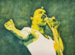
It didn’t take long for me to get around to painting Peter Green. I went for a triple portrait of Peter because his personal history made him a complex character and these triple portraits tend to bring out different sides of people.
It’s been painted posterised style using the traffic light colour scheme, so the process was to:
- Plan the values using the Notanizer app
- Put down a pencil outline using a grid
- Mask out the white highlights and spattering a little bigger masking fluid
- Put down a first layer of transparent yellow over all the lights, mediums and darks on the left and in the middle and rose dore on the right
- Put down a layer of cerulean blue over all the mediums and darks on the left and Winsor red in the middle and on the right
- Put down a layer of French ultramarine over all the darks
- Spatter on all the colours in the empty white areas, not worrying if a little bit gies on the portraits
- Remove the making fluid
- Tinker a little to improve the likenesses, maybe even adjusting the bars in the Notanizer app to find areas thatcould potentially benefit from being darkened
If I were to do this again, I think I’d not bother with the masking fluid. It’s great to be able to just throw on that first layer without thinking but I need bigger faces for this to work. With triple portraits (and with heads and shoulders, not just faces), it’s too difficult to do detailed work with the masking fluid. Better to bite the bullet and have to concentrate when painting on that first layer.
The final paintings aren’t bad but the eyes would have been better without the masking fluid. And the necks look a little long. But I have drawn out a little bit of personality, a different bit in each portrait. Peter’s up for sale. To see the price, click here.

Leave a Reply