Before I start talking art, a bit of news. I retired on Tuesday. Eighteen months…

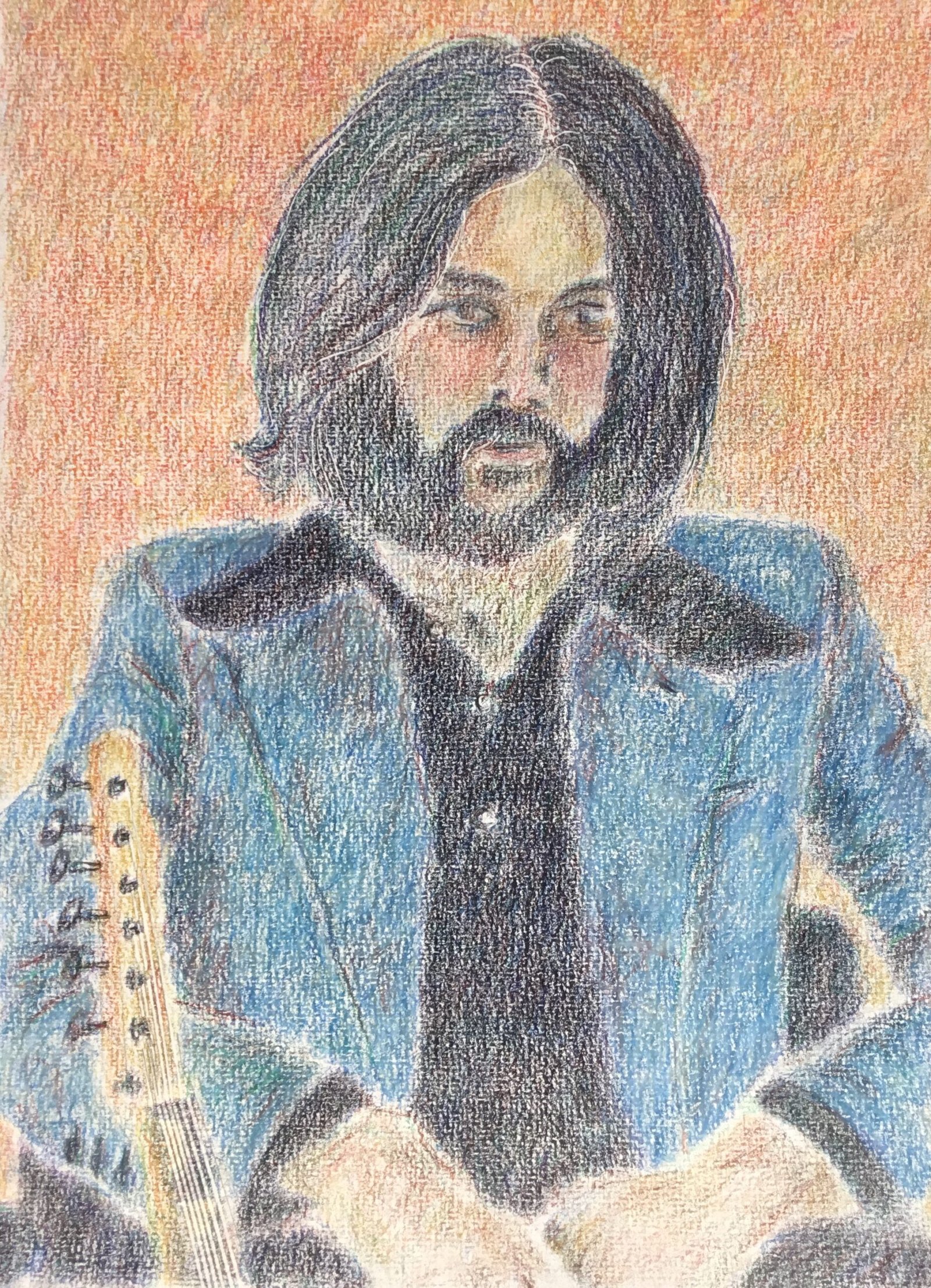
Eric Clapton, 1970
I’ve had loads of chores to do Sunday and Monday, leaving only a couple sessions available for painting. So I went for a coloured pencil portrait as I don’t feel rushed doing these and am happy to leave paintings half finished overnight. With my fondness for drawing guitarists, it was only a matter of time before Mr Clapton moved into my sights. This is based on his pose on the cover of his eponymously titled debut album. I’m including the year in the name of this painting as I can see myself coming back to Eric again at some point.
I followed my usual methodology for this one, putting down a pencil outline using a grid, marking guitar strings and the odd stray hair with a pointy stick and then applying colour but switching between shapes whenever I needed a change. I tried to keep the layers of colour as light as possible but may have presses to hard in places at times. Anyway, let’s talk through the six major components.
For the black shirt, I reached for my four colour black combination, applying delft blue, then dark pthalo green, dark red and helio blue reddish in that order. Then I repeated those four layers, then repeated them again, so there are twelve layers of colour in that shirt.
For the hair and beard I used the same four colours in the same order but with fewer layers. The darker areas have two layers of each colour; the lighter areas only one. Both of the sets of layers in the beard and the first layer in the dark hair on the head were applied in small circles but in the subsequent layers on the head I tried to follow the direction of the hair with my pencil strokes. In those later layers, I also tried to let the individual colours show through more.
There’s not much to say about the guitar colours: I just applied unimaginative local colours.
For the jacket, I started with a layer of cadmium orange as this is the complement of the blue that I wanted to end up with eventually. I added a layer of cold grey II and several layers of different blues. I incorporated other colours in the most shadowy places and over creases. The jacket ended up a lot darker than the light blue jacket on the album cover and I tried to lighten it by burnishing over it in white but this has made a coloured pencil jacket look like something drawn in crayon.
The two elements I had most fun with were the flesh and the background. For the face and hands, I started with yellow across the forehead, red on the cheeks and the end of the nose and green and blue in the lower part of the face. Then I added whatever impressionist colours I could see in the photo and some dark colours in the darkest areas.
For the background, rather than going with the grey/white from the album cover, I decided to go for something orangey to complement the blues in the jacket. From some earlier swatches, I identified the most interesting oranges as combinations of either cadmium yellow or dark Naples ochre with either pale geranium lake or rose carmine. And with some interesting Tedeschi Trucks music in the background, the time felt right for jamming. So I took one of the yellows in each hand and jammed all over the background in both big loops and little circles. Then to avoid left/right bias I swapped hands and applied another layer. This was great fun. I was feeling like Curtis Holder. I added two layers of two handed reds the same way. Then I repeated the yellows and repeated the reds. Then, just to tone things down a little, I jammed over the whole background with a blue (one handed now) – I can’t remember whether it was ultramarine of light ultramarine but it worked. And finally, to give some earthiness and tu unify the random swirls, I added a layer of burnt ochre in small scribbly circles.
To finish off, I smoothed over everything (except the already burnished jacket) with a paper stump, trying to keep soft edges and take advantage of this paper’s ability to make coloured pencil paintings look like old, out of focus photos. And that was me done.
What I’ve ended up with isn’t my best but I think it’s good enough to go in the shop window. The jacket is the biggest letdown, although the likeness isn’t perfect either. But I really like the colours in the background, the hair and the flesh. And my paintings are all about the colours. Oh, and I’ve captured some of Eric’s essence. I don’t know whether he was stoned or just tired when his photo was taken but whatever it was I think I managed to catch it. I do like it when my paintings tell stories and this one does.


Leave a Reply