


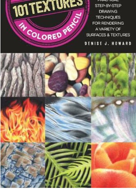
This one's 128 pages long. It's a hardback and was going for only £8.50. I…
101 Textures In Colored Pencil. Denise J. Howard – Book Review
It’s that time of year when the artwork slows down a bit because I’ve been through a birthday and have a pile of new books that I’m eager to get reading. My birthday was yesterday and not all my parcels have arrived yet, so I’m holding back on posting news of all my new books and gear until I can photograph them all together but that doesn’t stop me getting started with reading and reviewing, so let’s go…
First up is 101 Textures In Colored Pencil by Denise J. Howard. It’s a 128 page paperback and more A5 sized than the typical A4–ish art instruction book.
There are about 15 pages of introduction at the start on materials and basic techniques. It was interesting to see how Denise holds a pencil, right down near the end as if she were writing with it. At least one other book that I’ve read (and quite possibly all of them) tells me to hold the pencil as far away from the endpoint as possible, and that’s something I’ve been doing. It helps me to remember to keep the pressure light and I won’t be changing my approach in the near future. Still, I didn’t put this book on my Amazon wishlist because I thought it could teach me basic techniques. Because it’s the rest of the book (apart from a five page gallery at the back) that I was interested in.
You see, the rest of the bookings about creating textures in coloured pencil. I can’t believe I just looked at the contents page to check this but there are 101 textures covered. People, animals, nature, food and drink, materials, it’s all there. 101 textures is a lot. Each texture has a single page devoted to it, with each page being a four step demonstration of a little vignette featuring that texture. Like most coloured pencils demonstrations, they’re a bit prescriptive and reminiscent of knitting patterns, telling the reader exactly what colours to use. But I quite like these demos. Four steps is just right, neither too many nor too few. I don’t mind the prescriptive style and the photos of the steps are even more useful than the text. And I like how the first sentence or two in the first step is a little introduction. Like having a couple of sentences about a dish in a cookery book before getting on to the recipe.
This is absolutely not a book to be read from cover to cover. I’ve read through the introduction and a handful of individual demos, that’s all. Because this is a reference work, to be consulted whenever I’m drawing something where I want to realistically replicate the texture. So there’s no inspiration to be found from huge photos of the author’s work and none of the author’s personality coming through the way it does when you read a book from cover to cover. That’s why books like this will always struggle to score more than three palettes.
And three palettes is what this one gets. Remember, three palettes from me mean that a book was definitely worth buying. It’s just that a reference book isn’t ever going to excite me enough to get that fourth palette. Of course, if I find myself keeping coming back tenths book and using techniques from it, I may end up upping that score. But it’s three palettes for now. Good job Denise. Glad to have you on my shelf.
🎨🎨🎨
You can find this book and more reviews of it at Amazon UK here. As an Amazon Associate, I earn commission from qualifying purchases but this costs absolutely nothing extra to you.
Leave a Reply